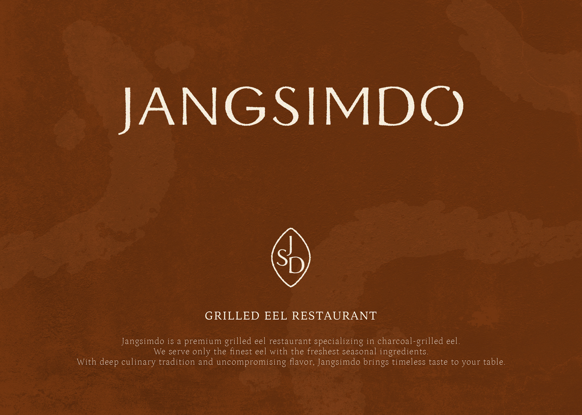
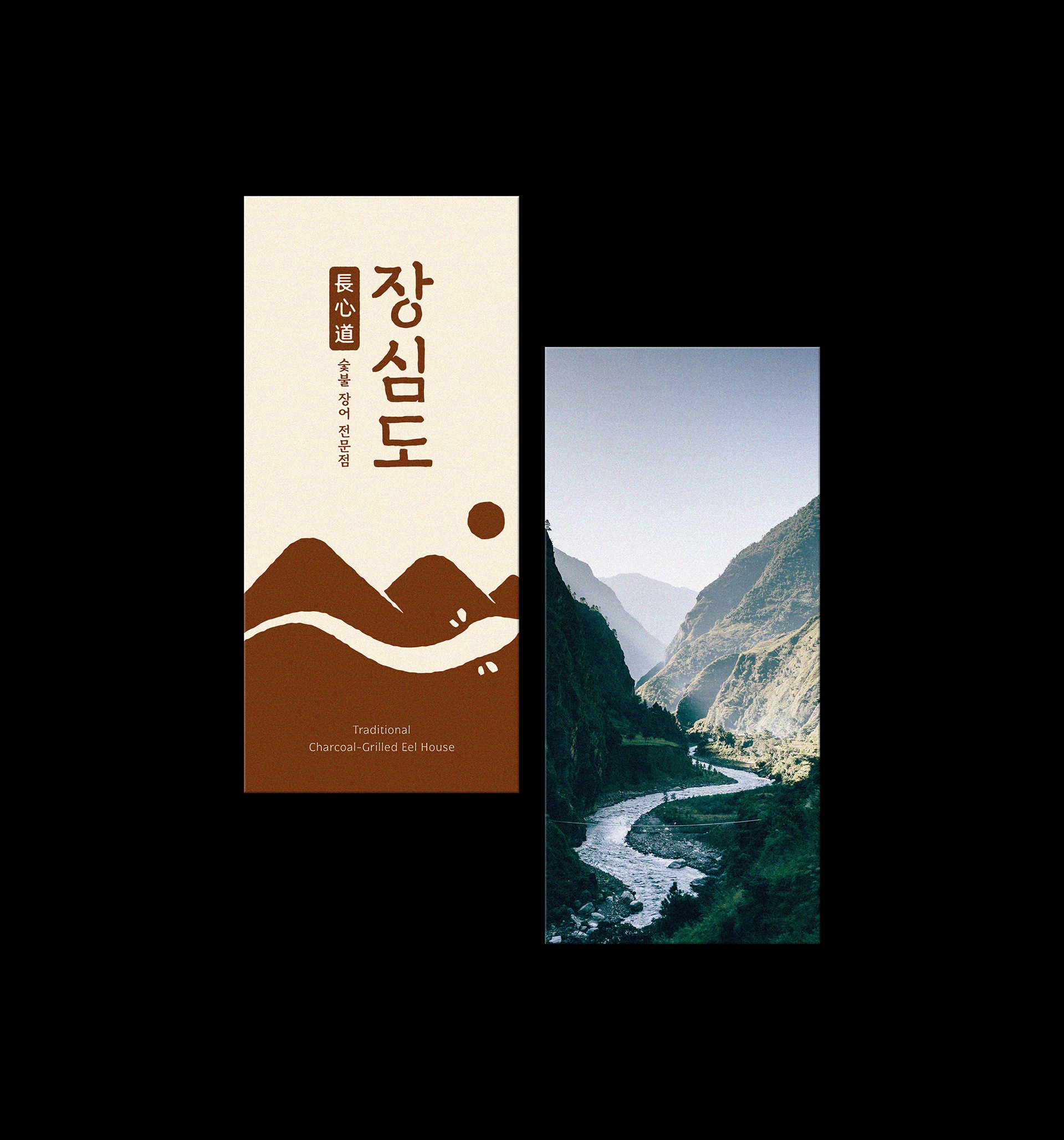
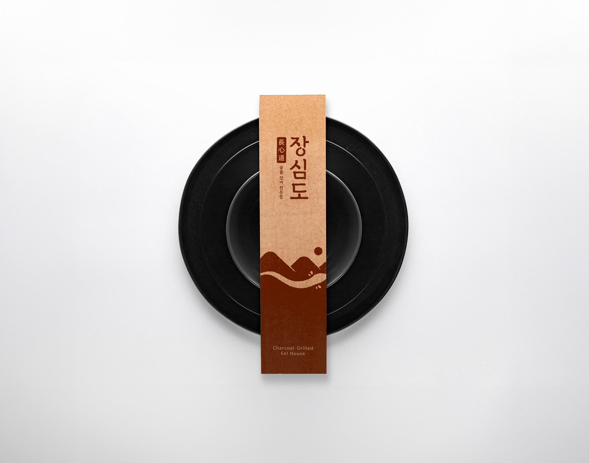
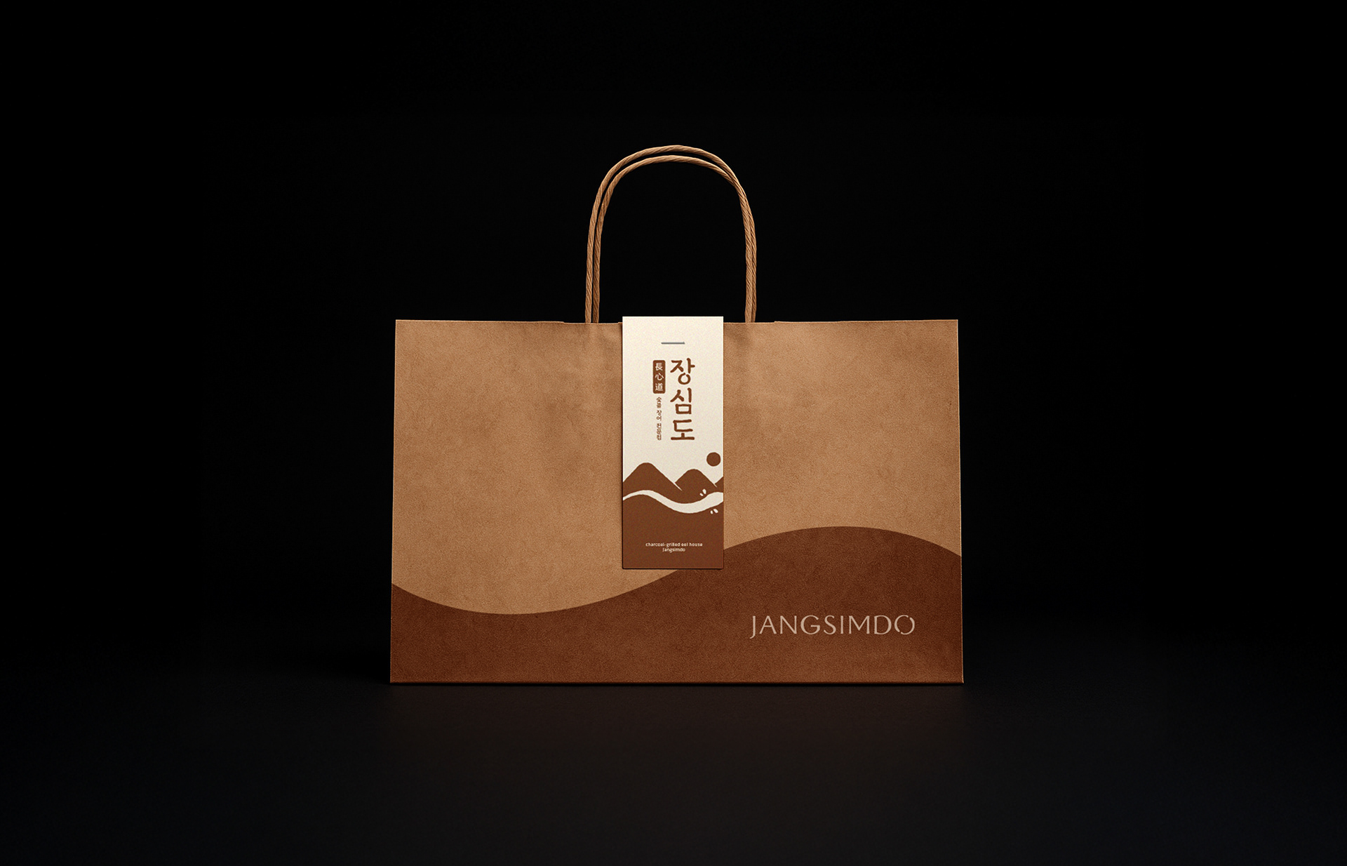
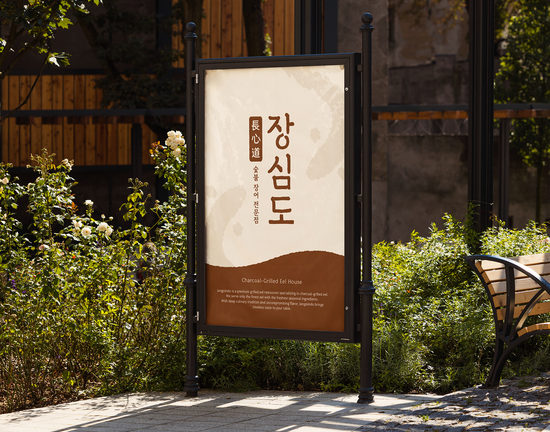
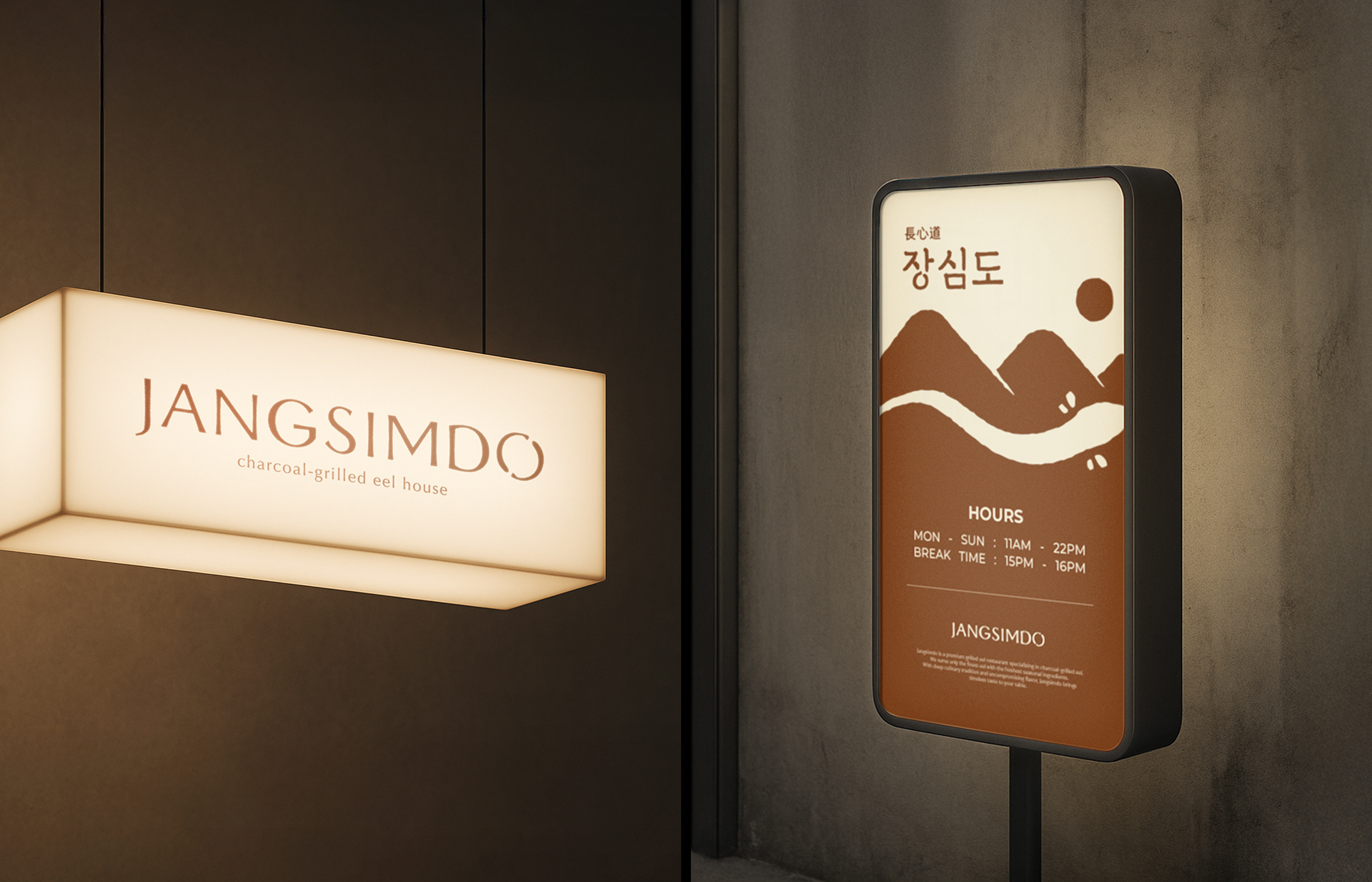
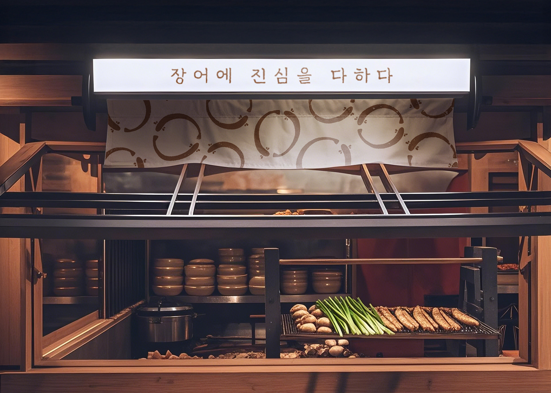
Jang Sim Do (長心道)
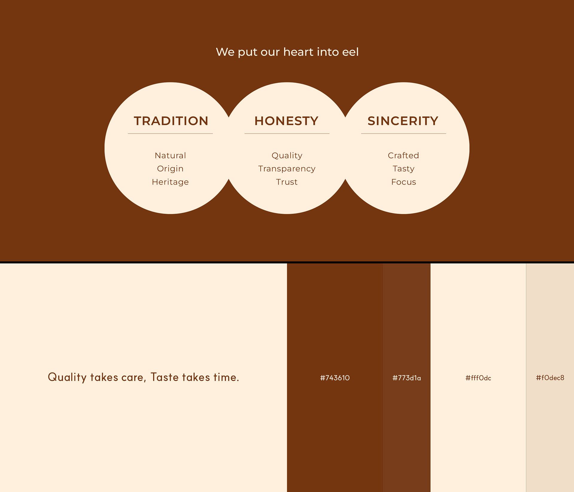
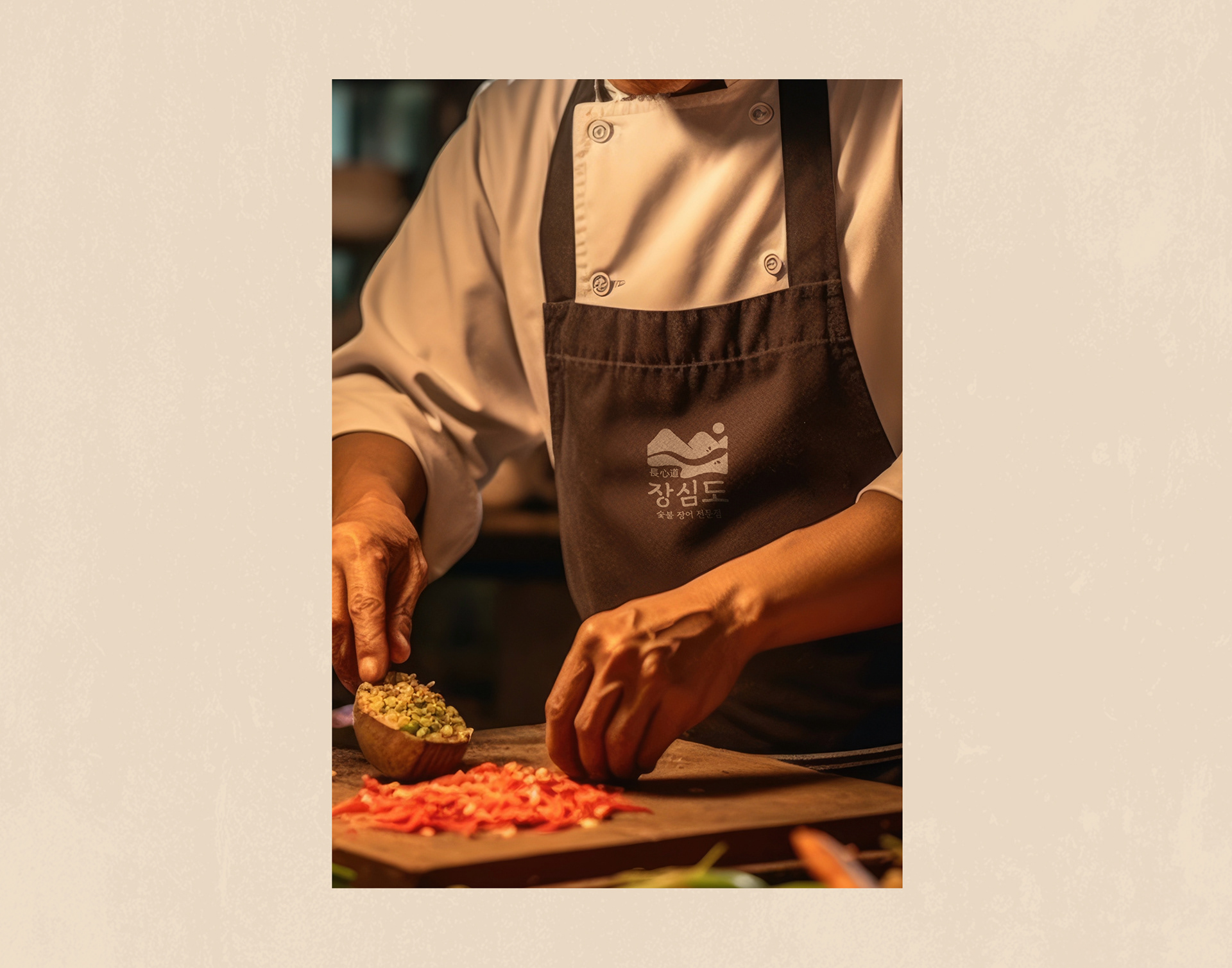
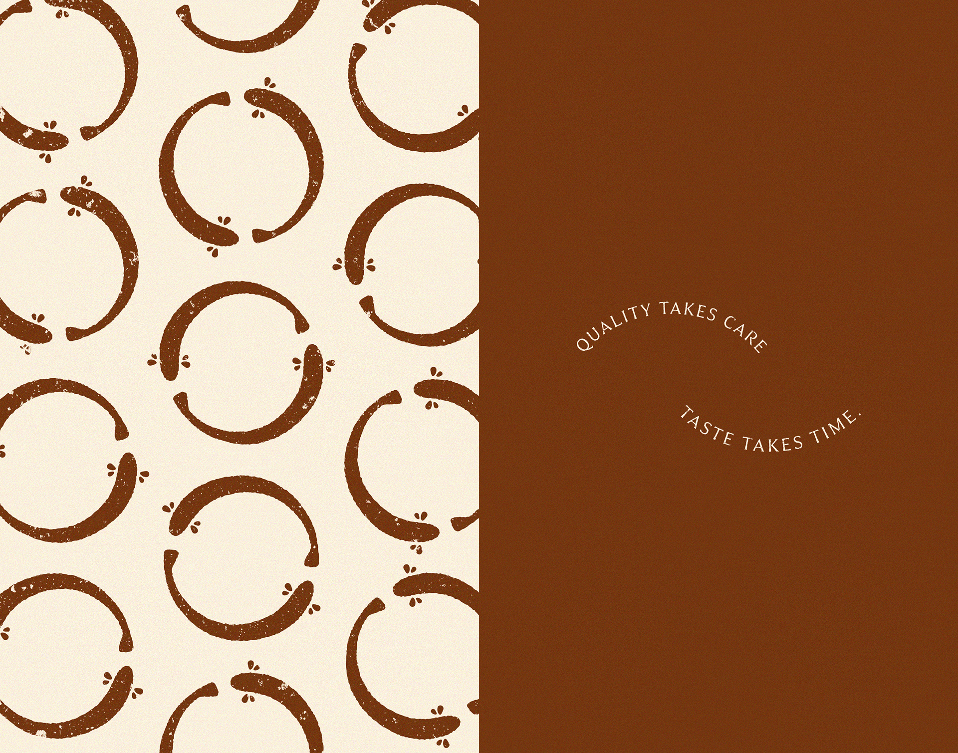
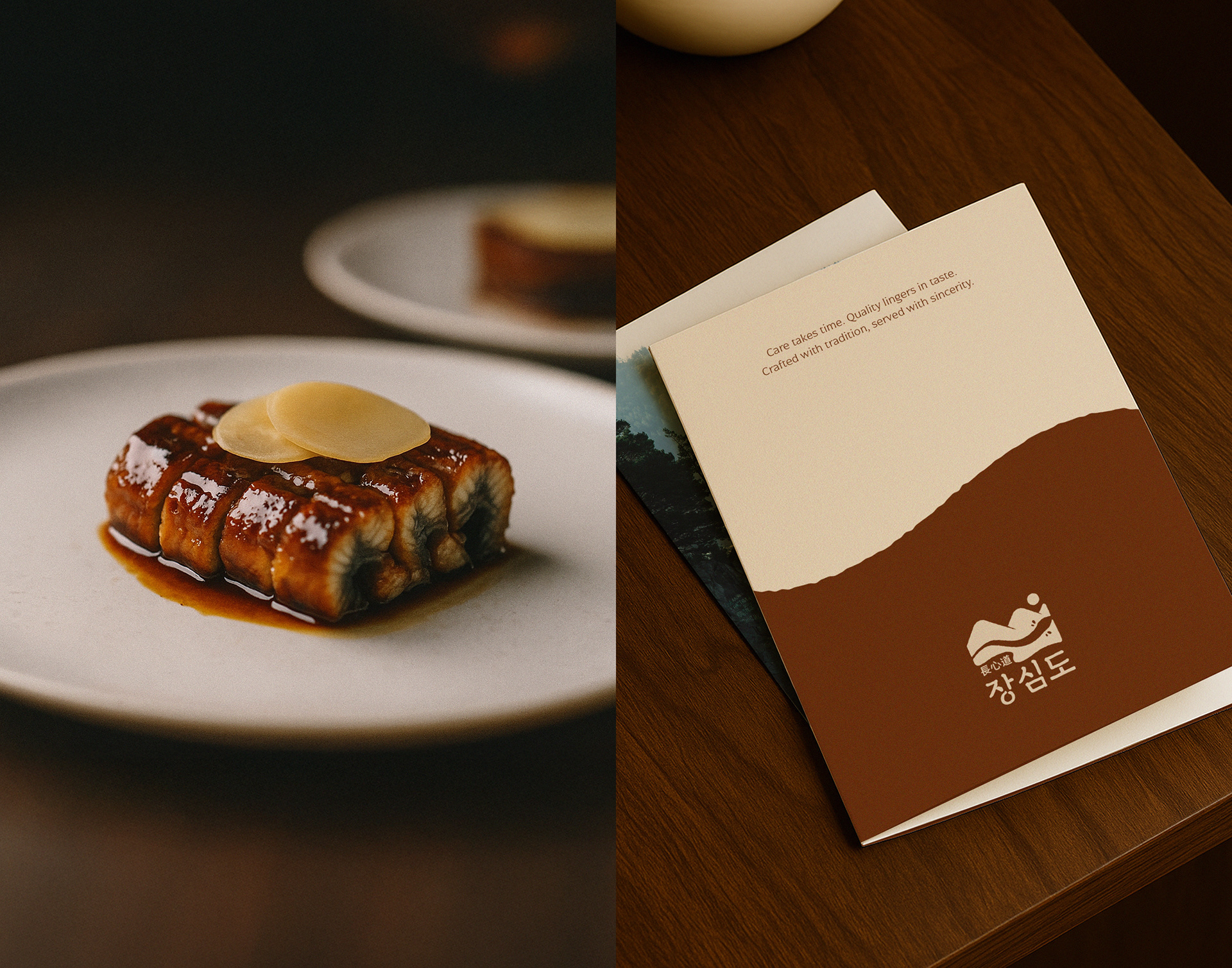
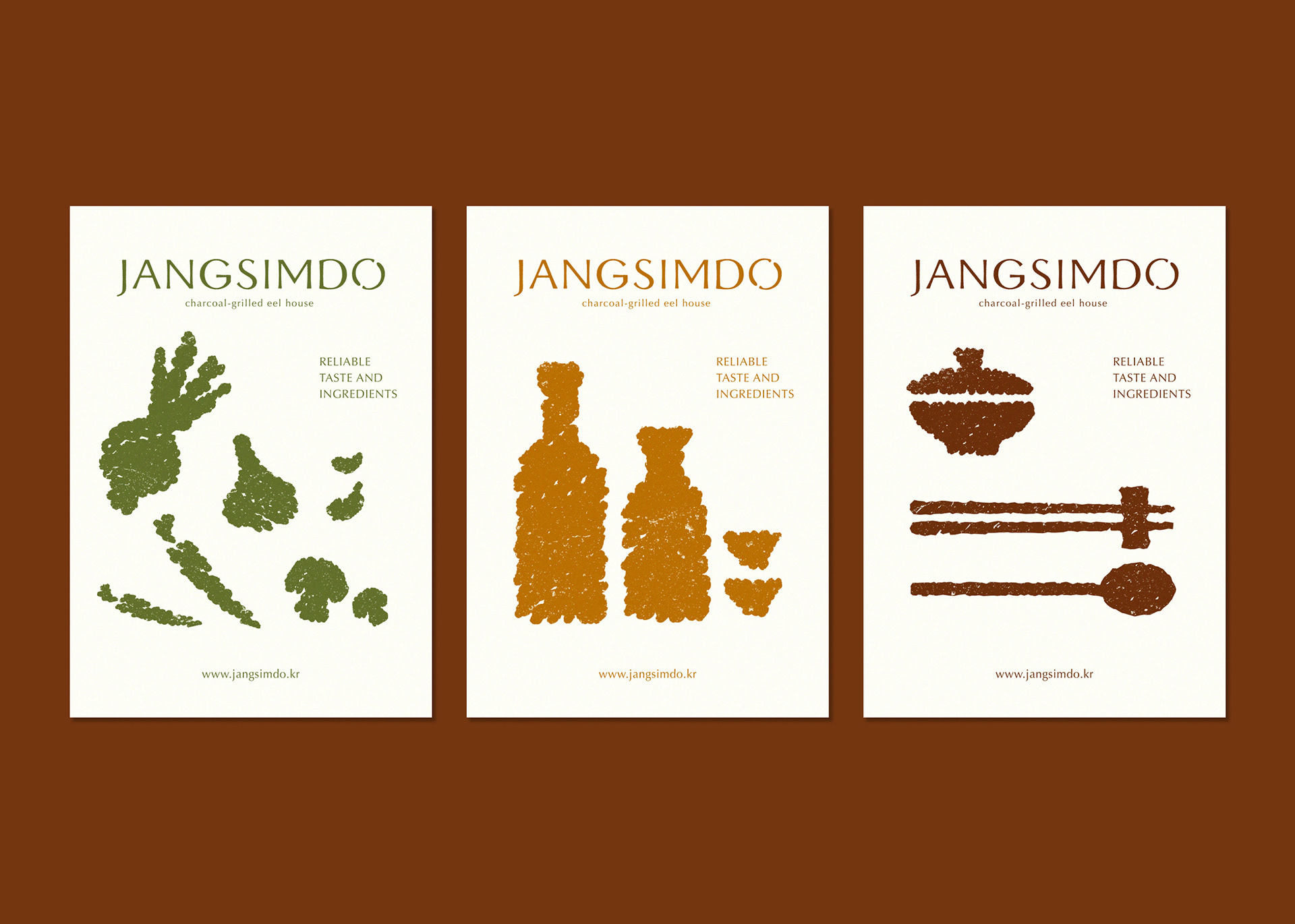
JANGSIMDO is a charcoal-grilled eel brand that offers a deep, refined culinary experience rooted in traditional cooking methods, natural ingredients, and artisanal
care. Its core design concept, centered on the ‘essence of nature’, visually captures the vivid dining moments that feel as if one is in harmony with the natural world.
‘장심도’는 전통적인 조리법과 자연 본연의 재료, 그리고 장인의 정성을 바탕으로 깊이 있는 맛과 품격 있는 서비스를 제공하는 숯불 장어 전문 브랜드입니다. 디자인의 핵심 컨셉을 ‘자연의 본질’로 설정하여, 자연과 하나가 되는 듯한 생생한 미식의 순간을 시각적 요소로 표현했습니다.
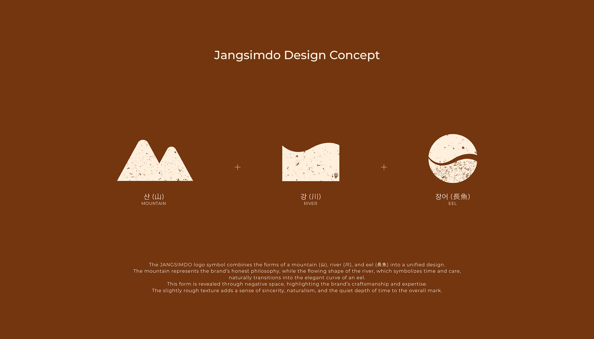
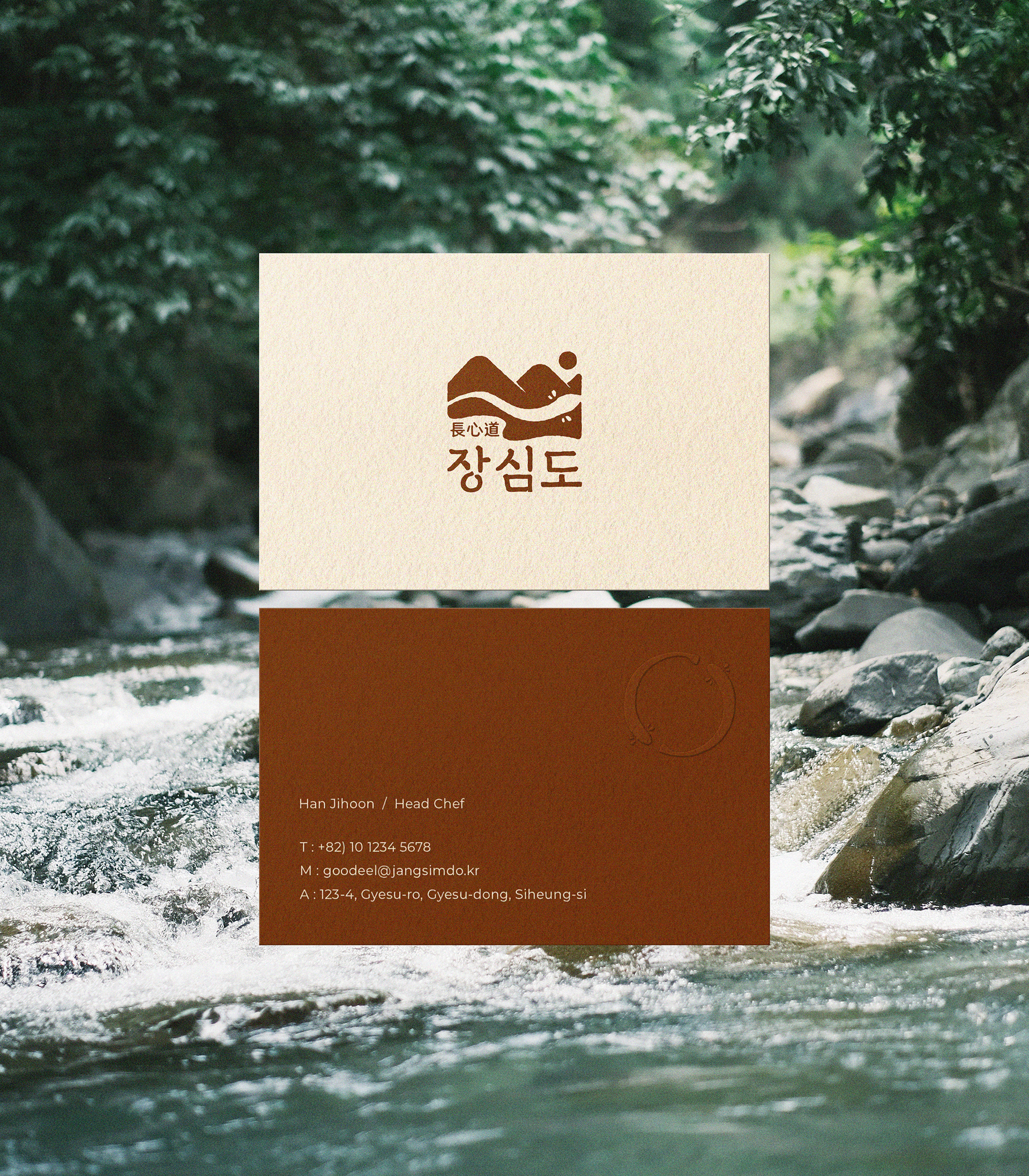
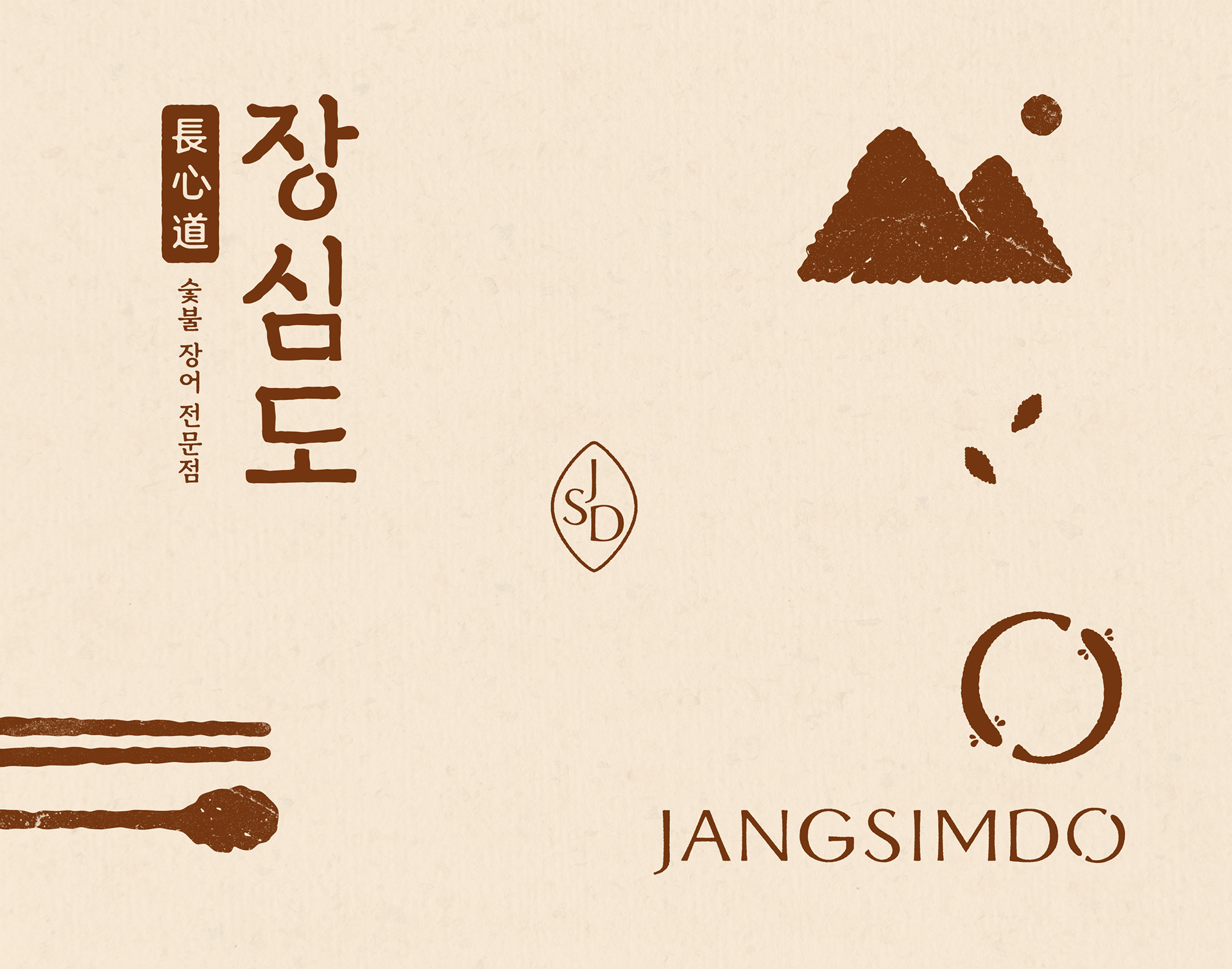
The logo symbol visually embodies JANGSIMDO’s core values honesty, tradition, and craftsmanship
through the forms of a mountain (山), river (川), and eel (長魚). The mountain represents the brand’s honest philosophy, while the flowing river symbolizes time and care rooted in tradition. Together, these elements merge into the elegant curve of an eel, expressed through negative space. The use of natural textures delicately conveys JANGSIMDO’s sincerity and artisanal spirit, while the eel-shaped detail within the logotype further reinforces the brand’s identity.
로고 심볼은 장심도의 핵심 가치인 정직함, 전통, 정성을 산(山), 강(川), 장어(長魚)의 형상을 통해 시각적으로 구현했습니다. 산은 브랜드의 정직한 철학을, 흐르는 강은 전통을 계승한 시간과 정성을 상징하며, 이 두 요소가 어우러져 장어의 유려한 곡선을 네거티브 공간으로 표현합니다.자연스러운 텍스처는 장심도의 진정성과 장인정신을 섬세하게 드러내고, 로고타입 속 장어의 형상화는 브랜드의 정체성을 나타냅니다.
Client : Baron fnc / Jangsimdo
Design : FEELQ WORKS
-
Instagram : feelqworks
Behance : feelqworks
Thank You
Design : FEELQ WORKS
-
Instagram : feelqworks
Behance : feelqworks
Thank You