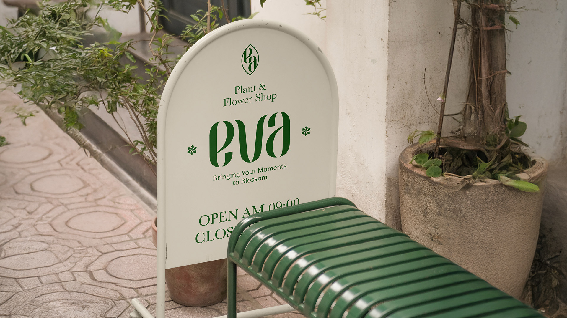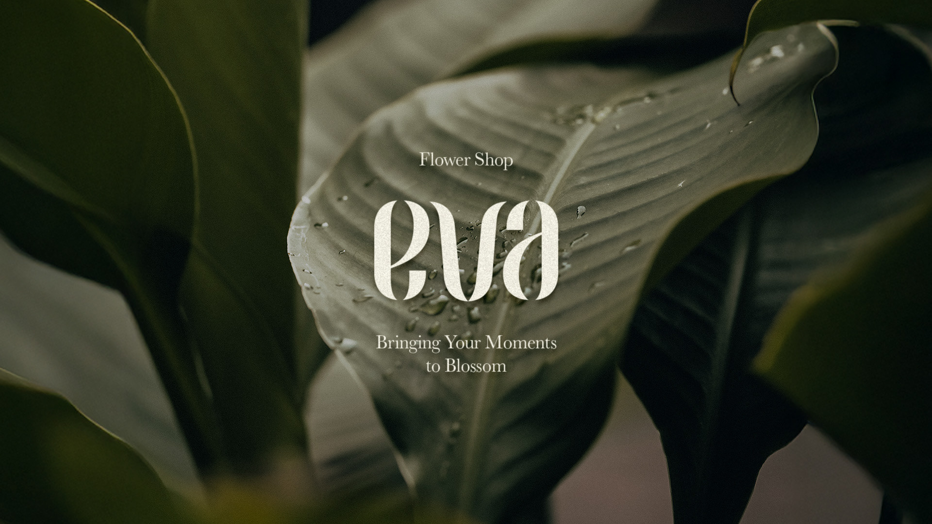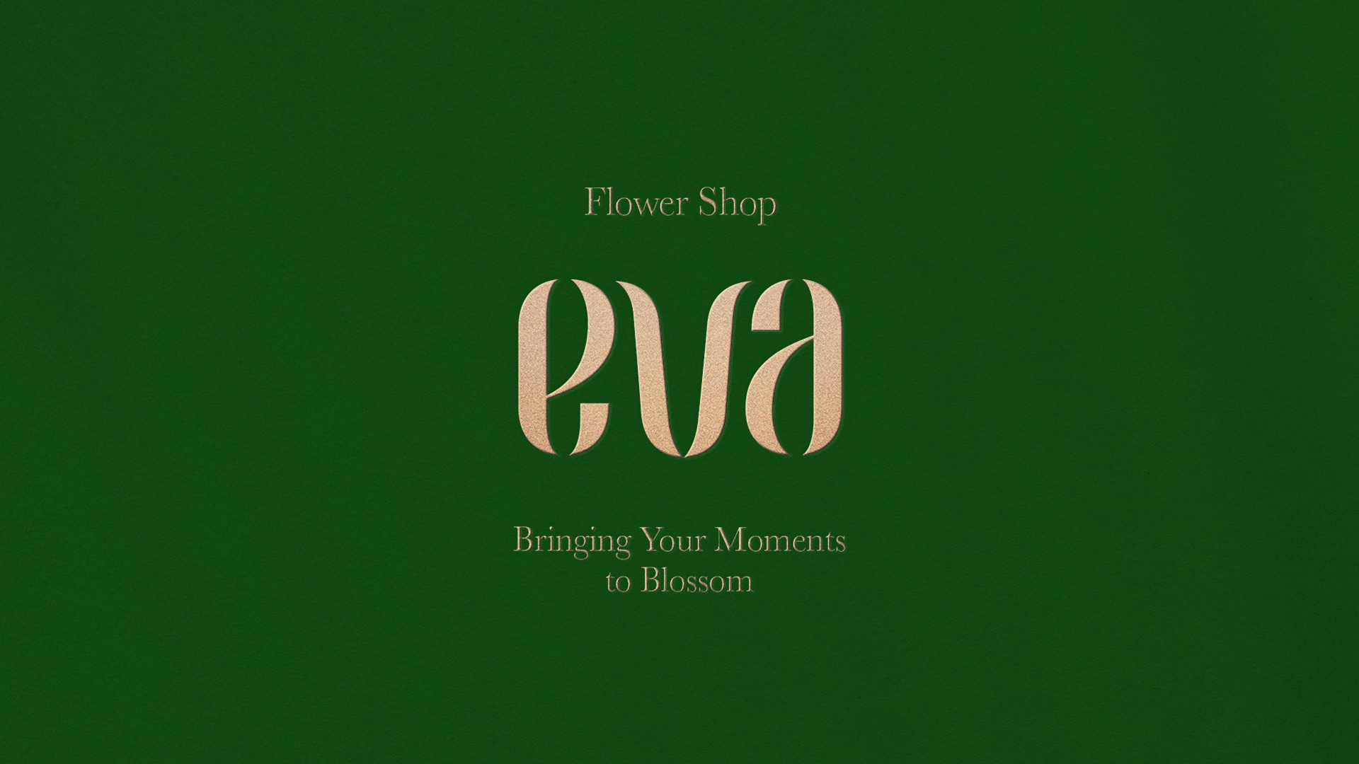
eva
EVA is a flower boutique brand that conveys fleeting emotions through flowers and brings the vitality of nature into everyday life.
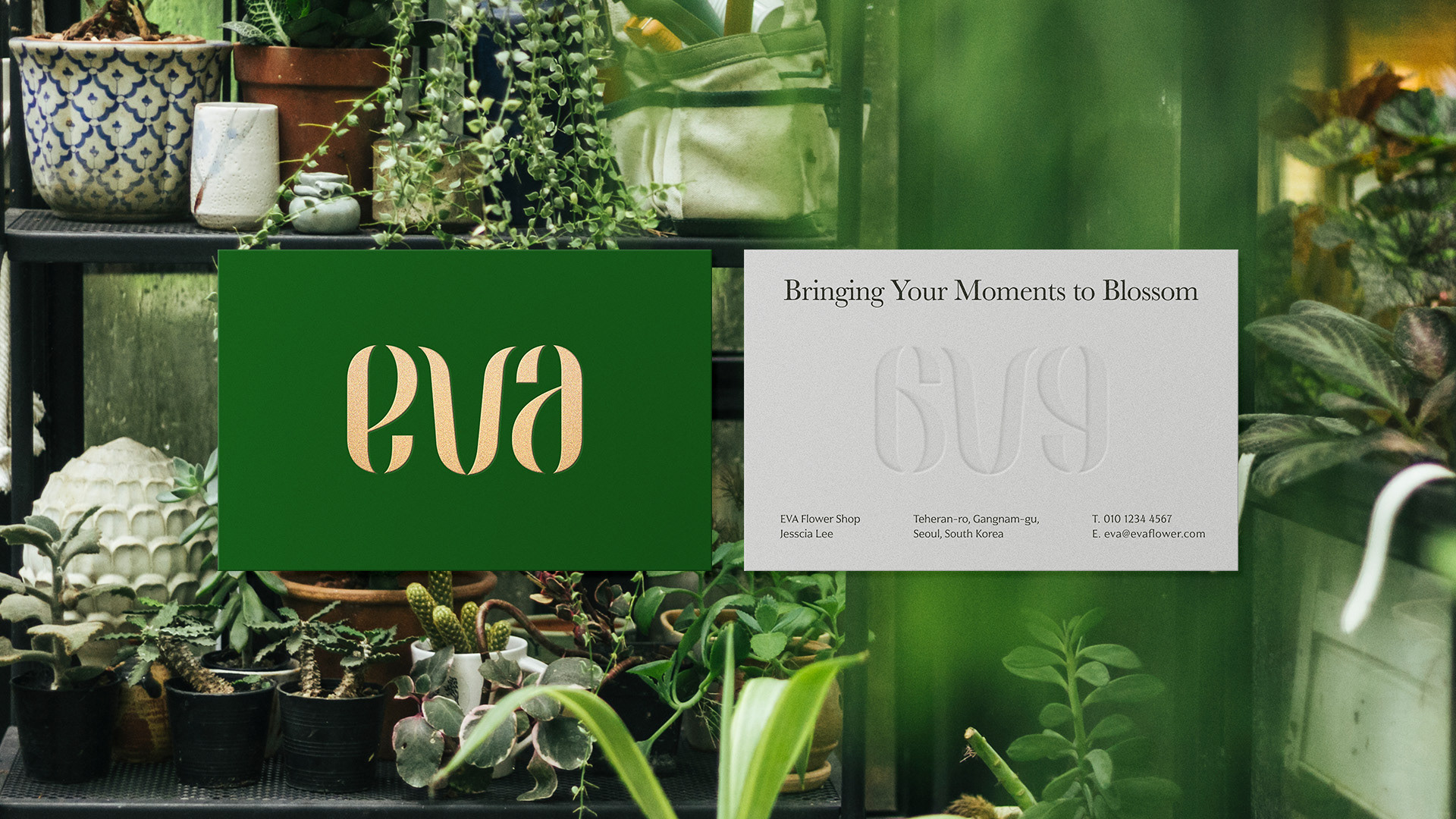
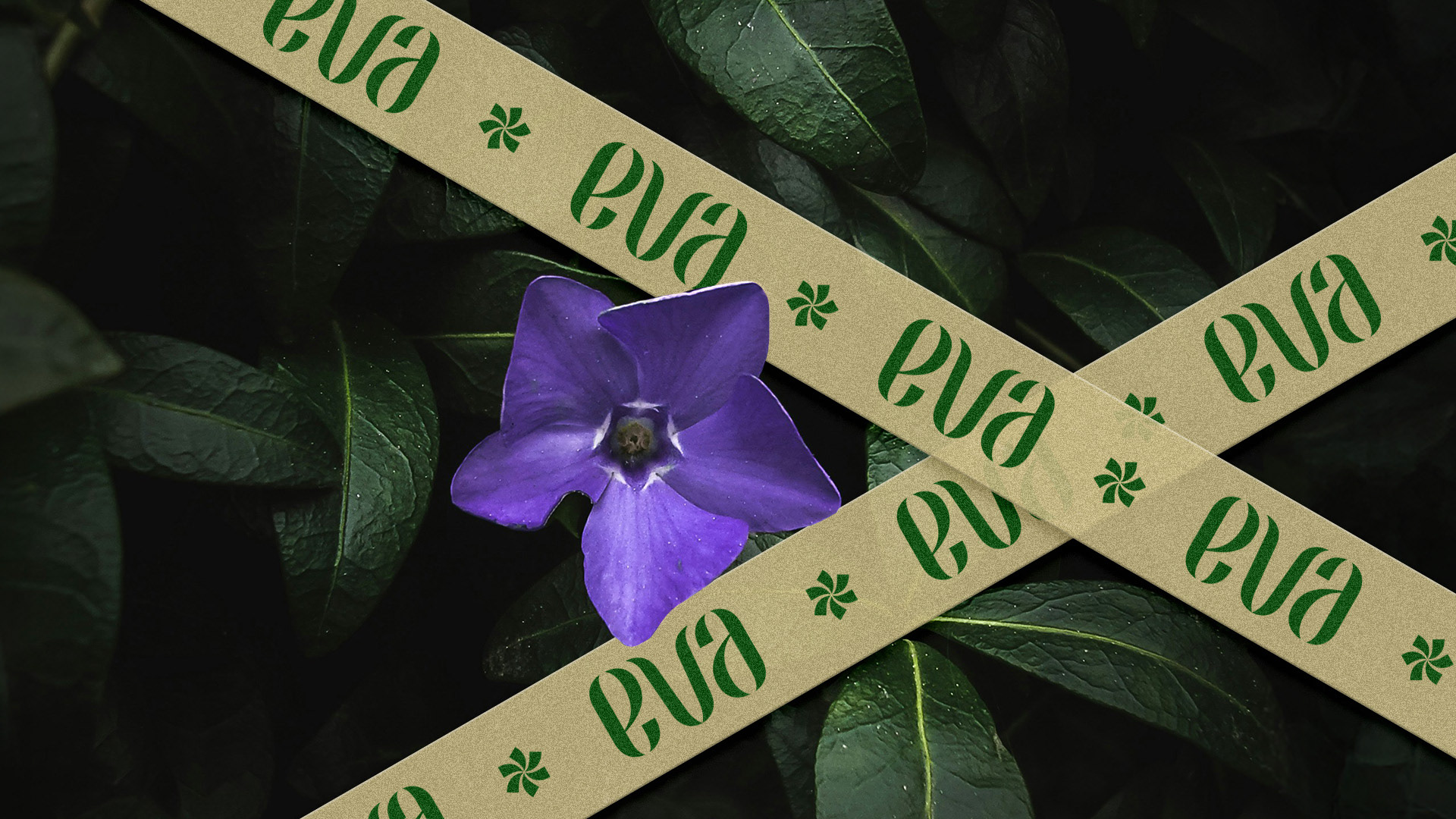
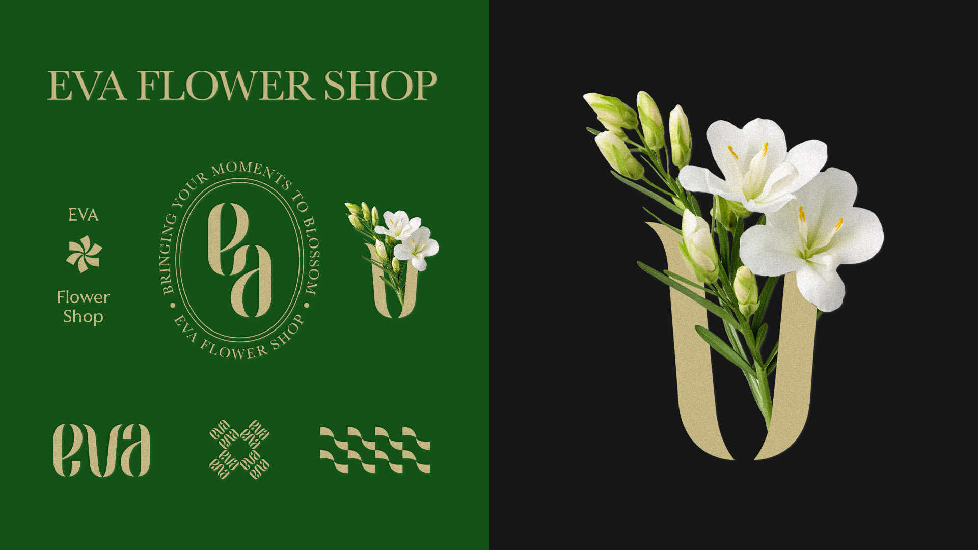
The brand name itself is interpreted as a natural element, expressed through soft curves and elegant flow to embody the brand’s visual identity.
The letters ‘e’ and ‘a’ symbolize, respectively, a sprouting bud and a dewdrop gently falling representing the delicacy of nature and the cycle of life.
The ‘v’ evokes the image of a blooming flower, metaphorically capturing the precious moments that blossom in customers’ lives.
The overall logo design emphasizes harmony through symmetry and rhythm, while the serif typography characterized by fluid curves builds a classic yet graceful brand image.
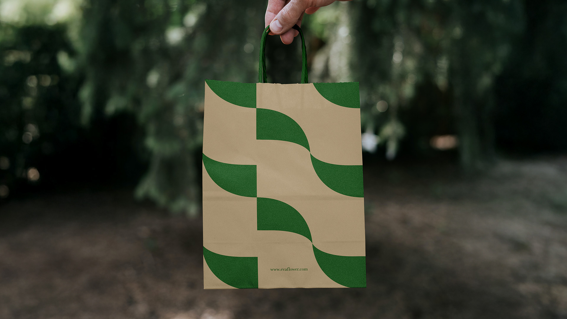
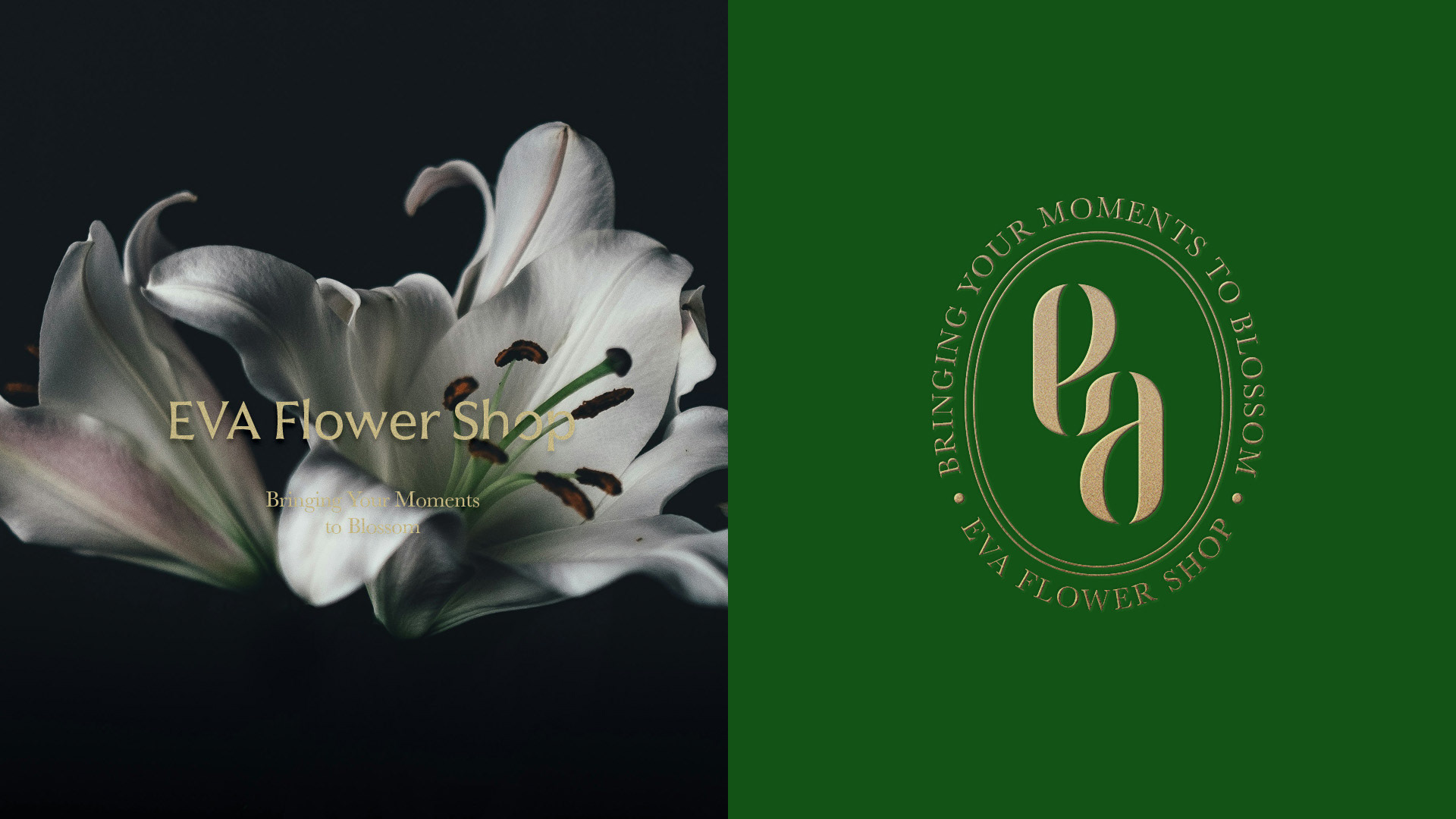
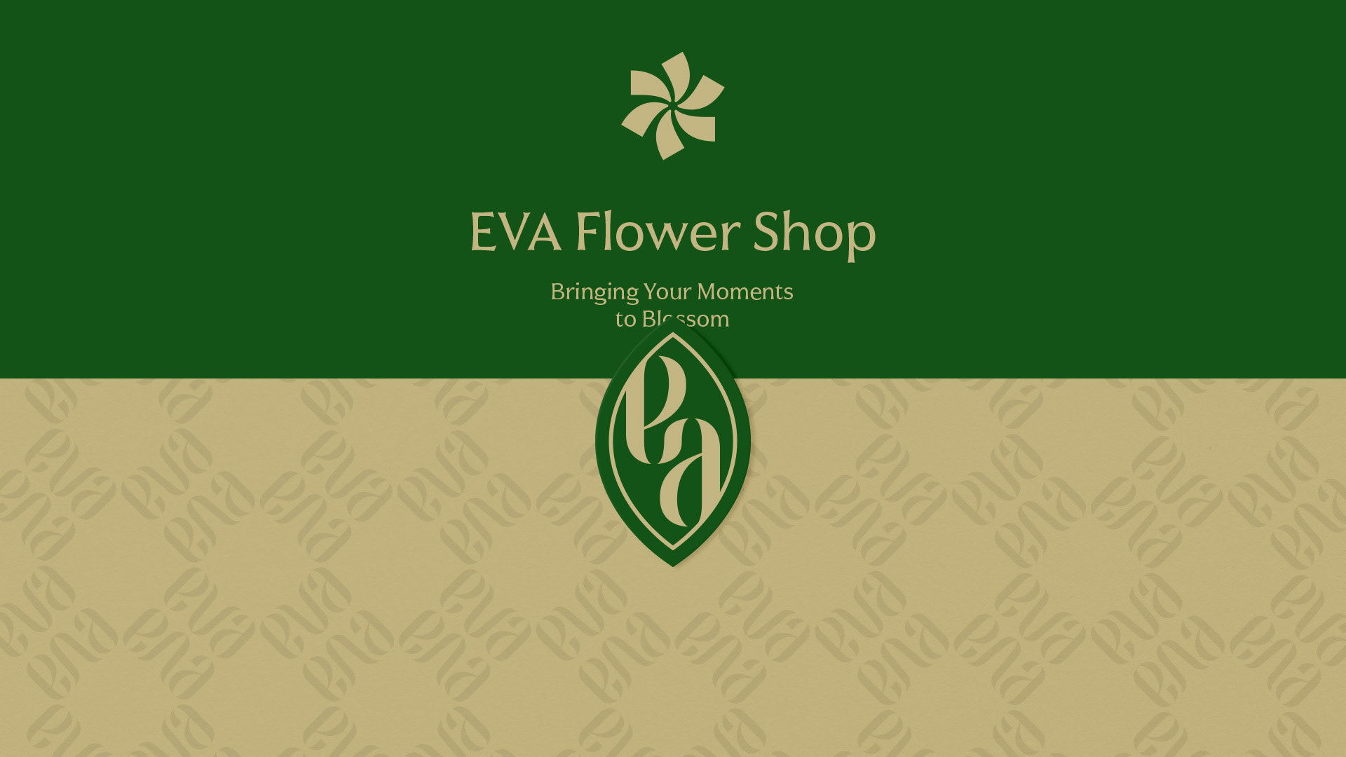
The brand’s color palette features deep green and gold beige, reflecting the vibrancy of nature along with a refined, luxurious mood. The secondary symbol, composed of rotating and repeating petals, represents vitality and dynamic energy. Typography and pattern elements also follow organic rhythms and flows, visually expressing EVA’s core philosophy : “A space where emotions bloom.”
The brand name itself is interpreted as a natural element, expressed through soft curves and elegant flow to embody the brand’s visual identity.
The letters ‘e’ and ‘a’ symbolize, respectively, a sprouting bud and a dewdrop gently falling representing the delicacy of nature and the cycle of life.
The ‘v’ evokes the image of a blooming flower, metaphorically capturing the precious moments that blossom in customers’ lives.
The overall logo design emphasizes harmony through symmetry and rhythm, while the serif typography characterized by fluid curves builds a classic yet graceful brand image.
The brand’s color palette features deep green and gold beige, reflecting the vibrancy of nature along with a refined, luxurious mood. The secondary symbol, composed of rotating and repeating petals, represents vitality and dynamic energy. Typography and pattern elements also follow organic rhythms and flows, visually expressing EVA’s core philosophy : “A space where emotions bloom.”
EVA는 꽃을 통해 순간의 감정을 전하고, 일상에 자연의 생명력을 더하는 플라워 부티크 브랜드입니다.
브랜드명 자체를 자연 요소로 해석하여 부드러운 곡선과 유려한 흐름으로 브랜드의 이미지를 나타냈습니다. ‘e’와 ‘a’는 각각 새싹이 돋아나는 모습과 이슬이 맺혀 떨어지는 형상을 상징하며, 생명의 순환과 자연의 섬세함을 나타냅니다. ‘v’는 꽃이 만개하는 형태를 연상시키며, 고객의 소중한 순간이 피어나는 장면을 은유합니다.
전반적인 로고는 대칭과 리듬감 있는 구성으로 조화로움을 강조하고, 곡선 위주의 세리프 타입 조형은 클래식하면서도 우아한 브랜드 이미지를 구축합니다.
브랜드 컬러는 짙은 그린과 골드 베이지를 사용해 자연의 생동감과 동시에 고급스러운 무드를 전달하며, 서브 심볼은 꽃잎의 회전과 반복을 통해 생명력과 에너지를 상징적으로 표현합니다. 타이포그래피 및 패턴 요소 또한 유기적인 흐름과 리듬을 통해 브랜드의 철학인 “순간의 감정을 꽃피우는 공간”을 시각적으로 전달합니다.