Bistro JEIL
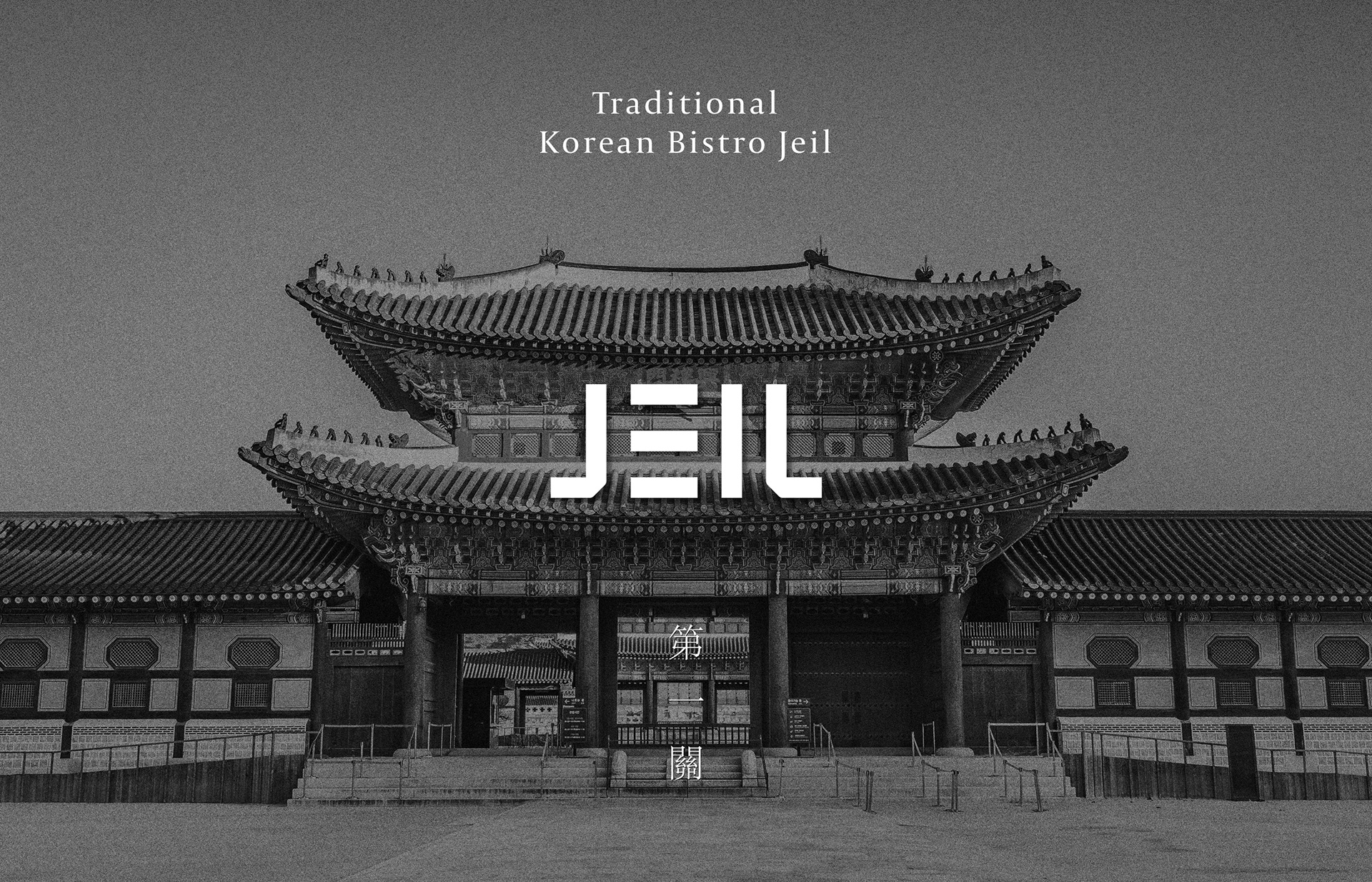
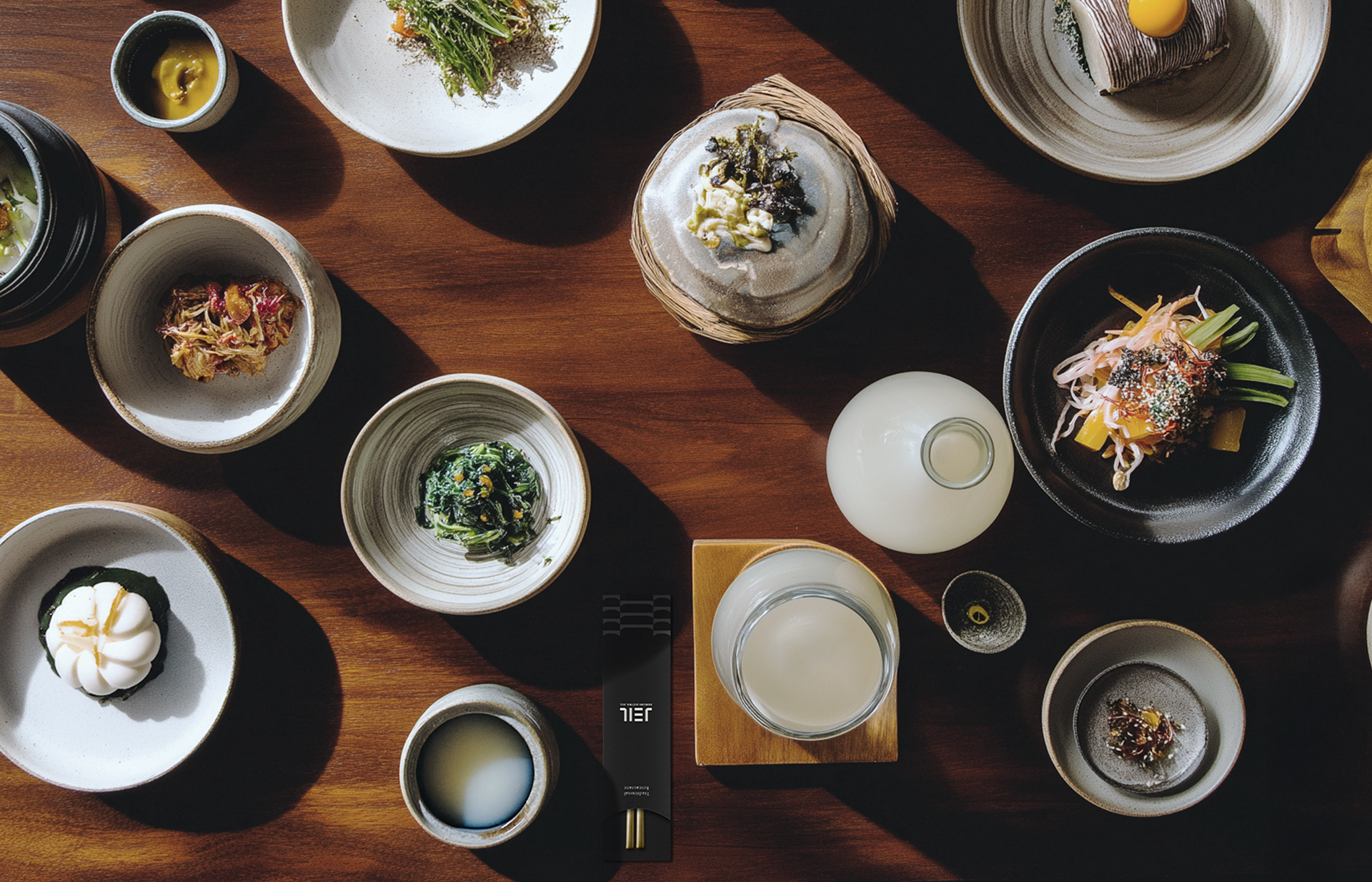
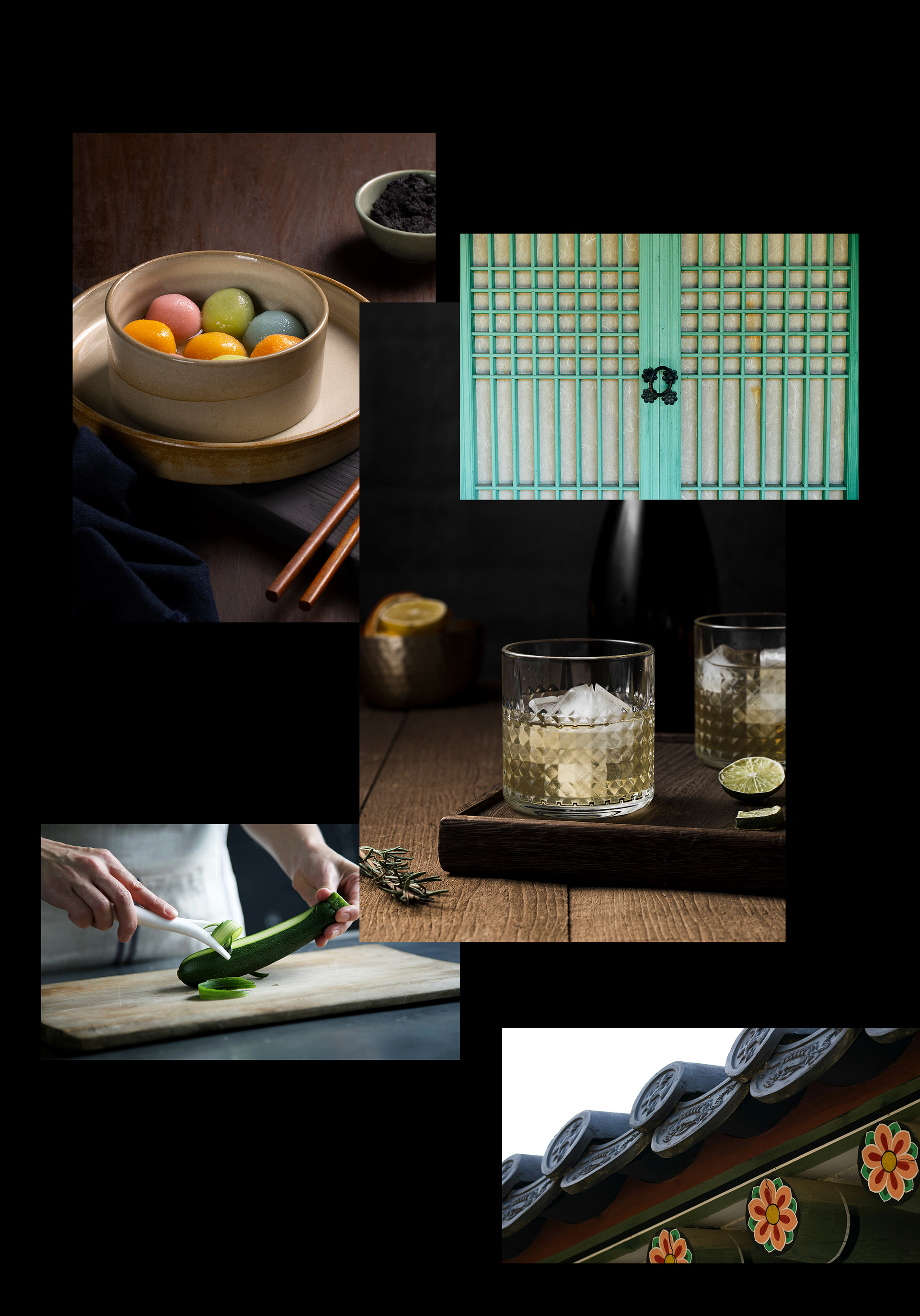
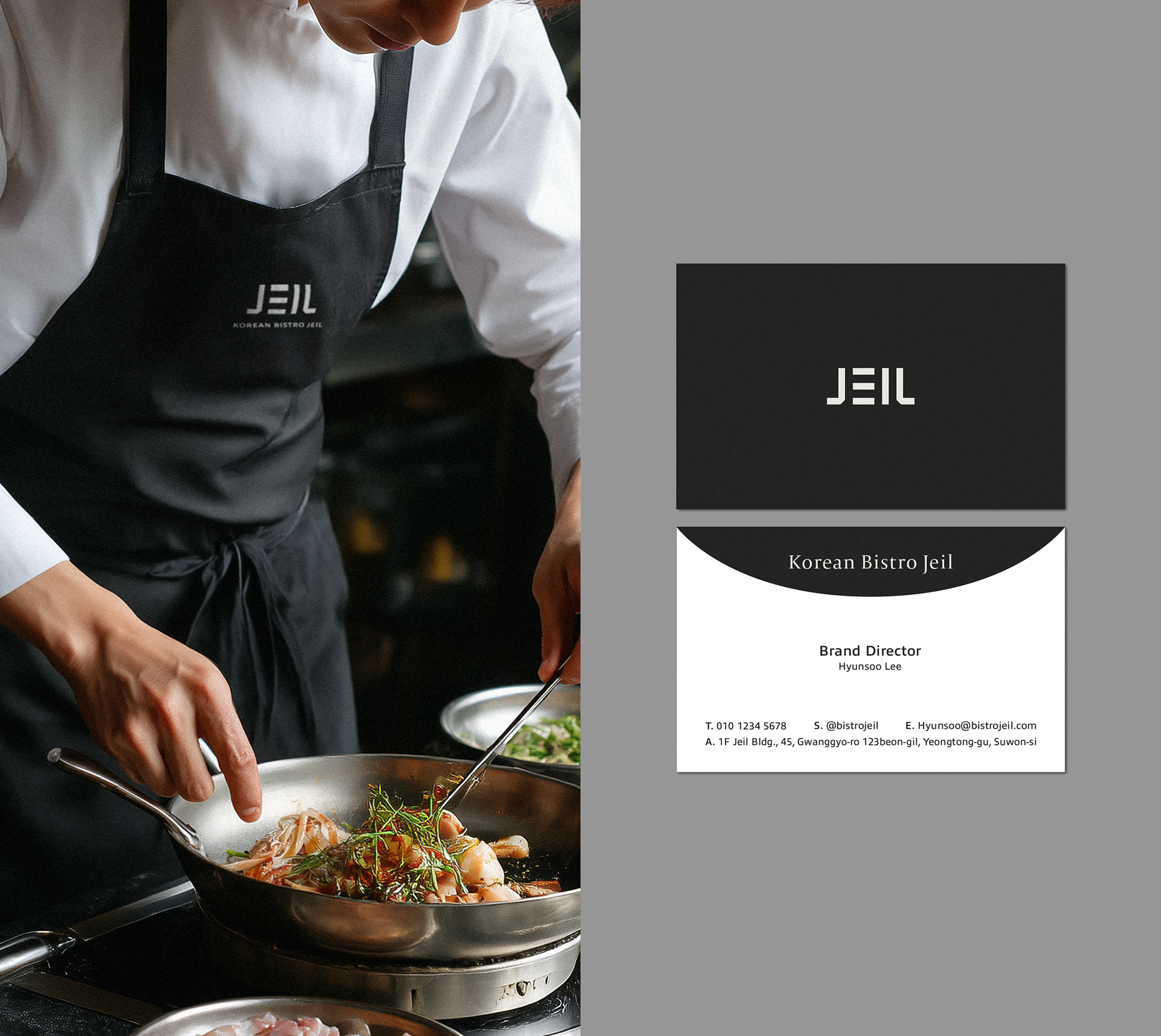
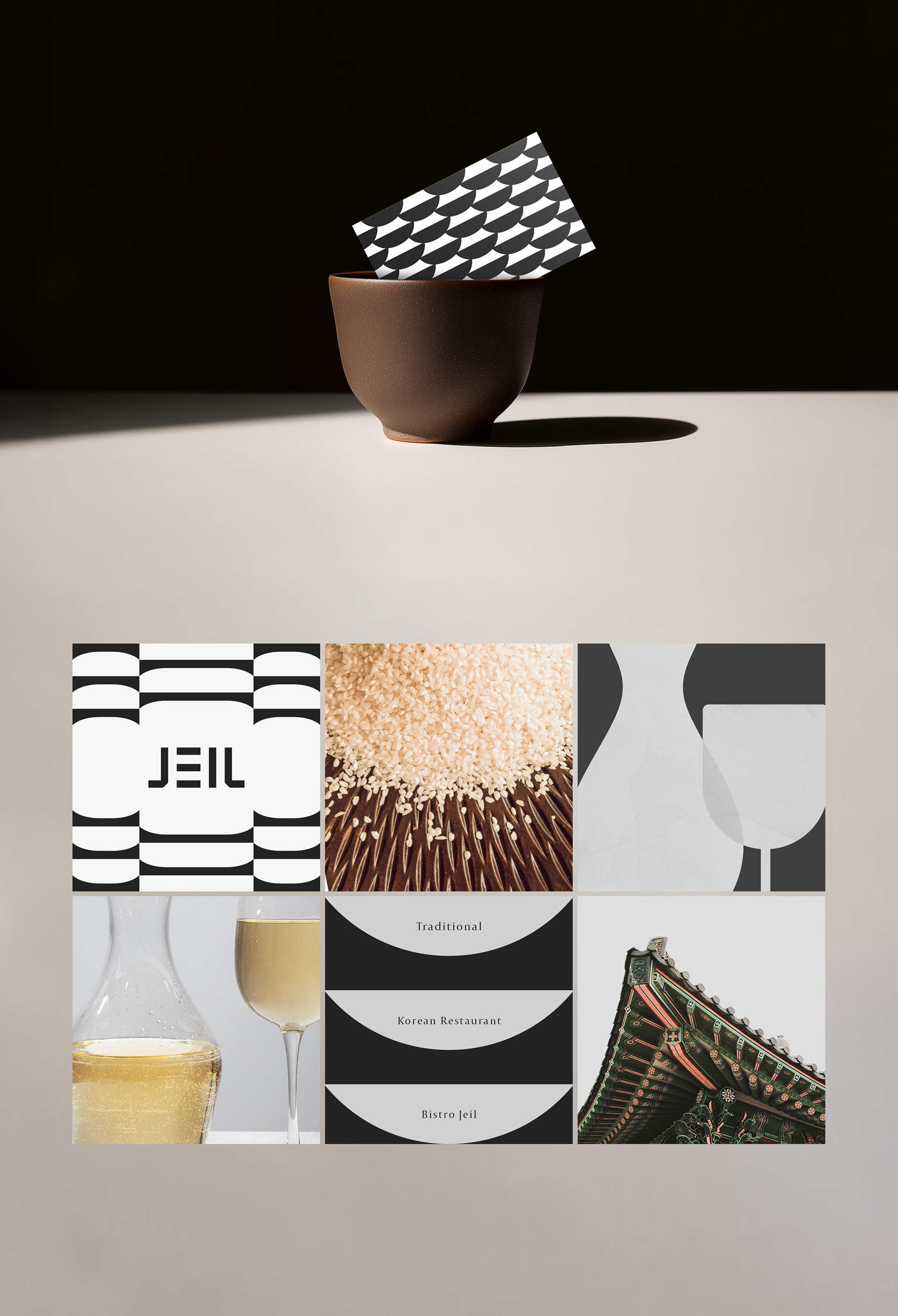
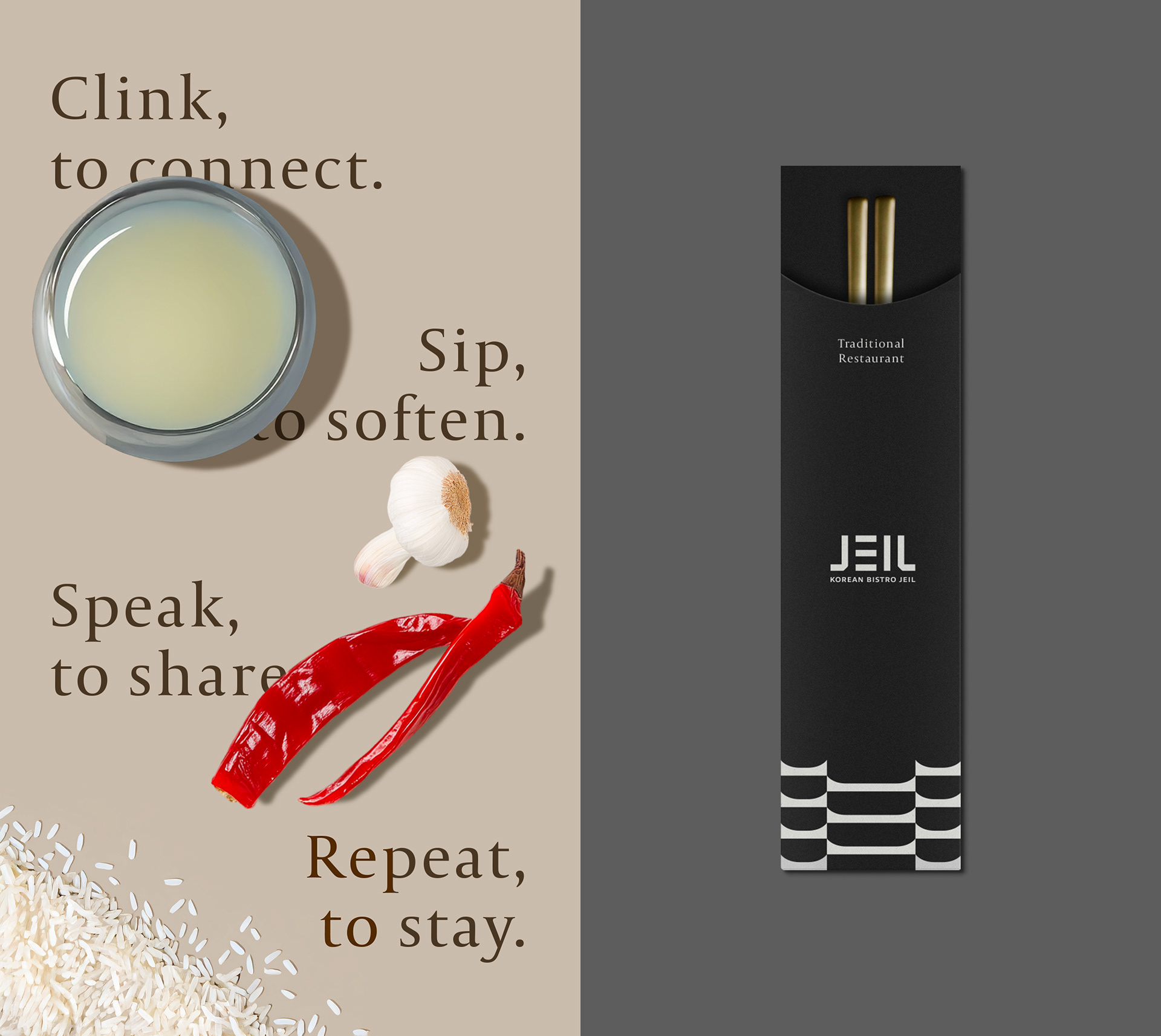
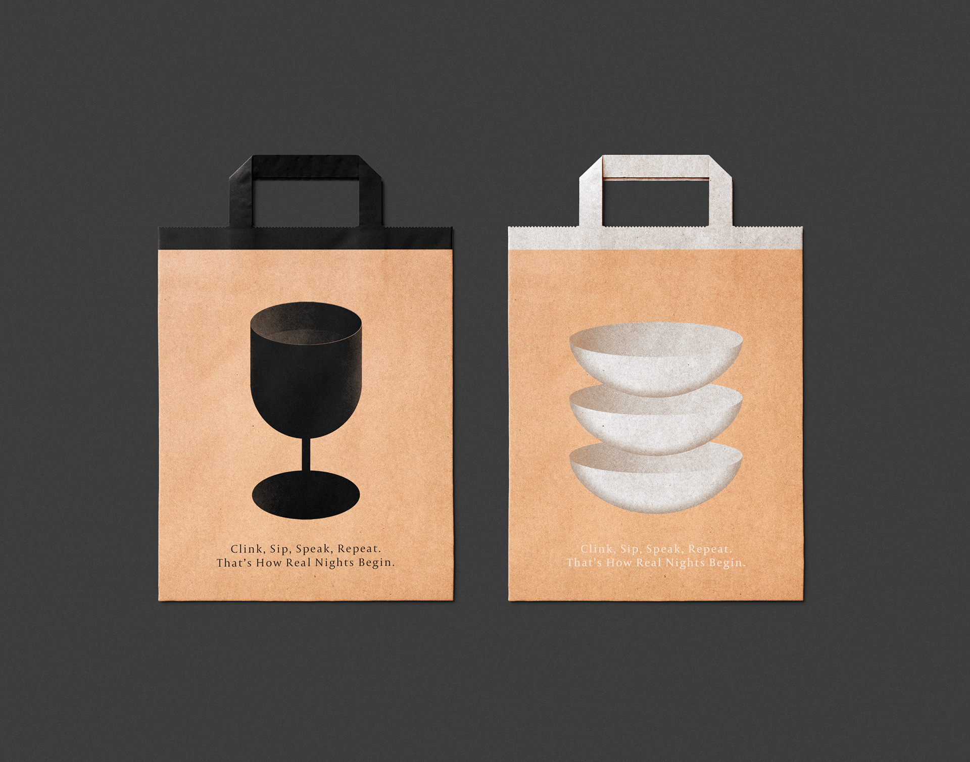
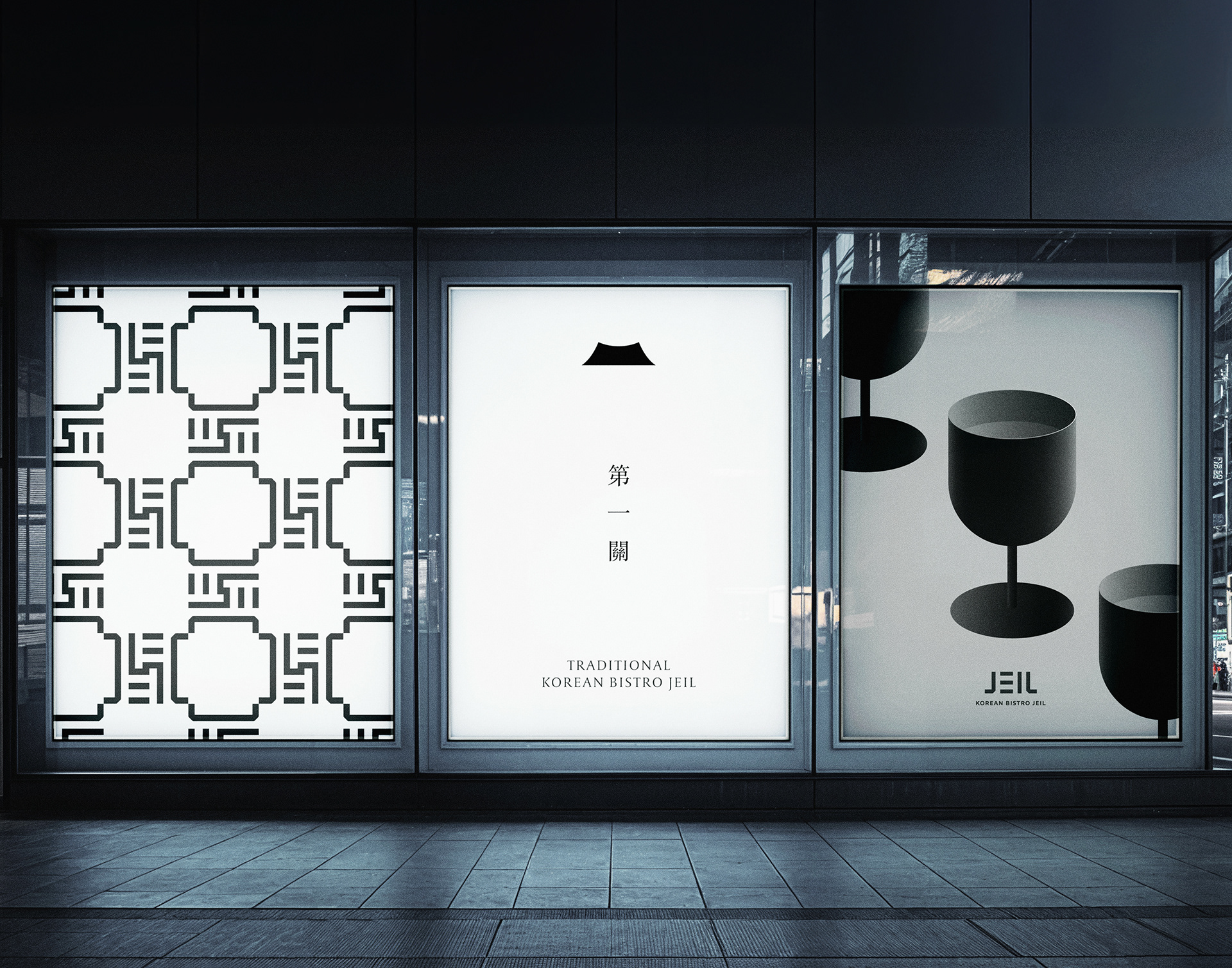
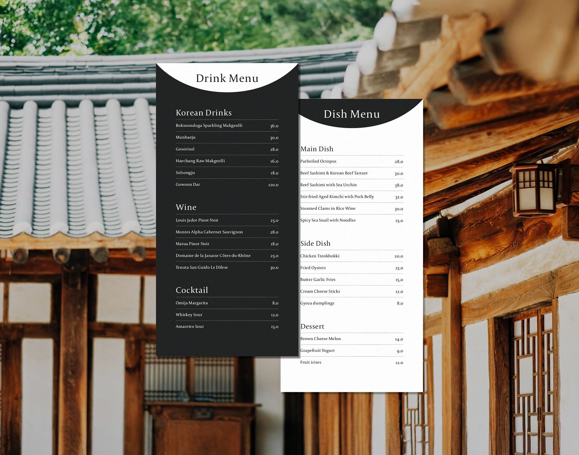
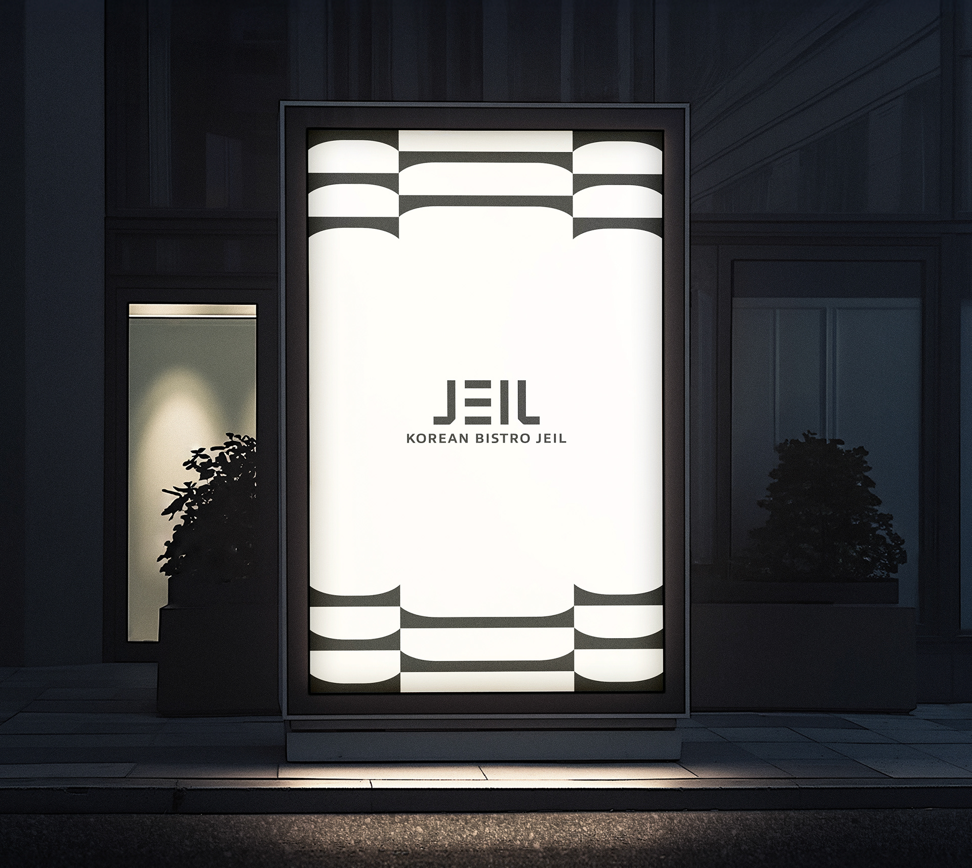
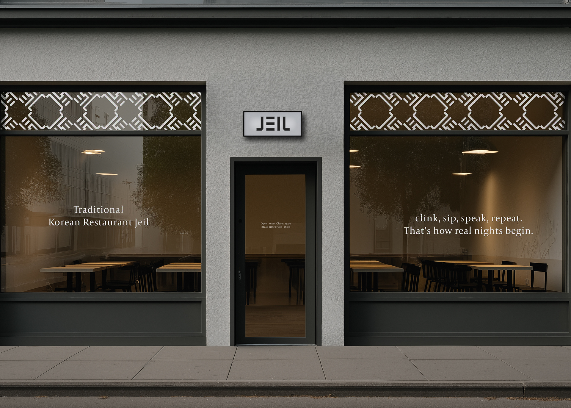
Bistro ‘JEIL’ is a modern Korean pub that reinterprets the rich flavors and elegant essence of traditional Korean cuisine through a contemporary lens. The brand design captures relaxed interactions centered around delicious food and drinks, creating an elegant, refined atmosphere where visitors can enjoy a sophisticated and sensory experience.
Bistro ‘JEIL’ is a modern Korean pub that reinterprets the rich flavors and elegant essence of traditional Korean cuisine through a contemporary lens. The brand design captures relaxed interactions centered around delicious food and drinks, creating an elegant, refined atmosphere where visitors can enjoy a sophisticated and sensory experience.
-
‘제일관’은 전통 한식의 깊은 맛과 멋의 정체성을 현대적으로 재해석한 모던 한식주점입니다. 맛있는 음식과 술을 중심으로 편안한 소통이 이루어지는 경험을 브랜드 핵심 가치로 표현했으며, 단아하고 세련된 분위기를 통해 방문객이 감각적으로 즐길 수 있는 공간으로 완성하였습니다.
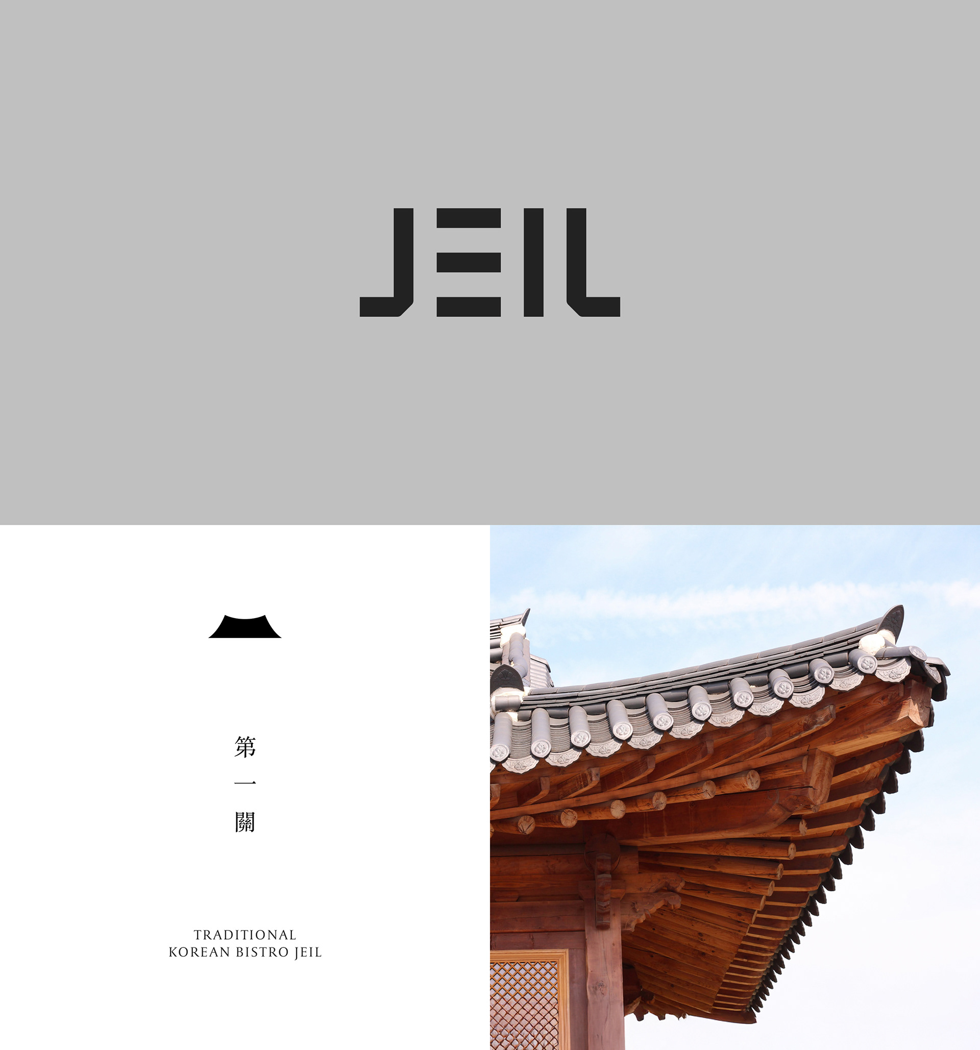
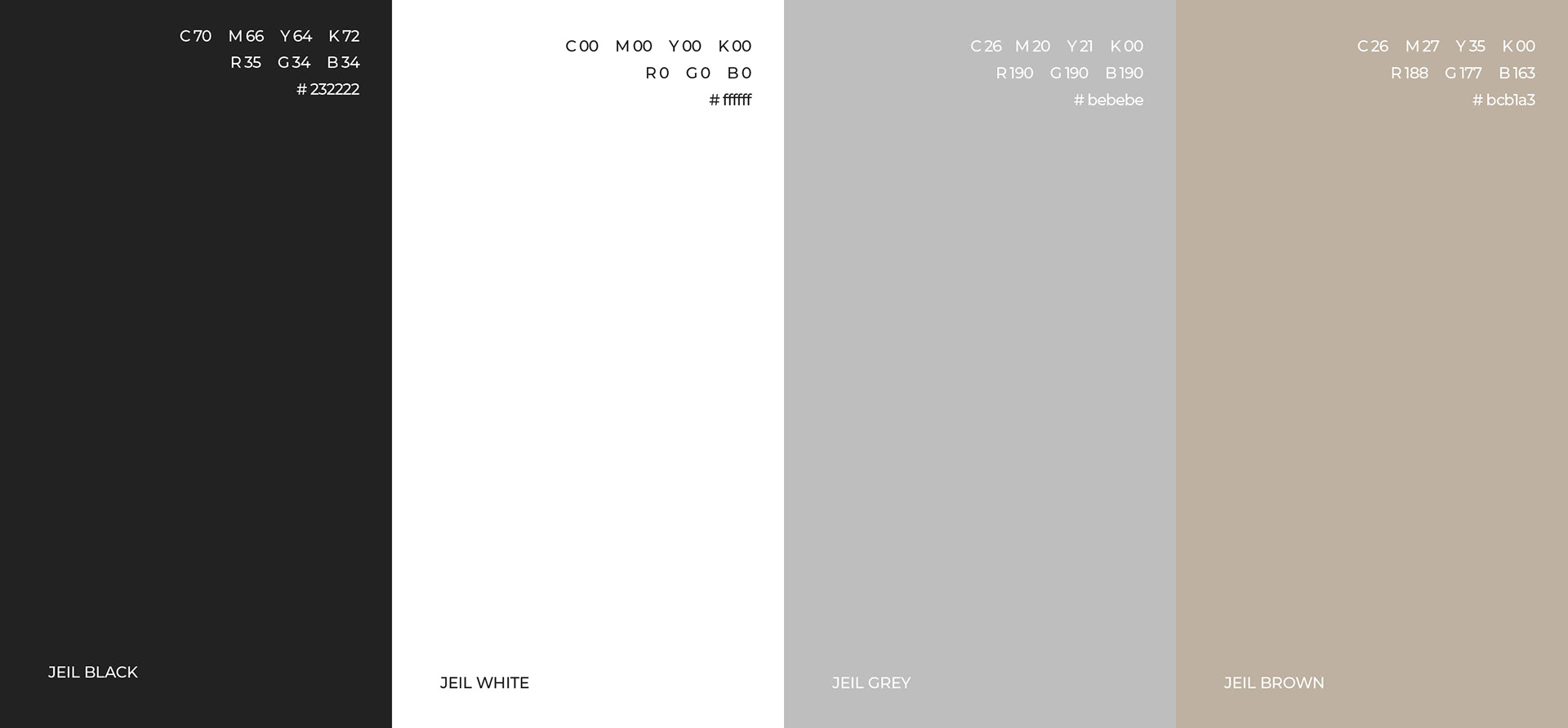
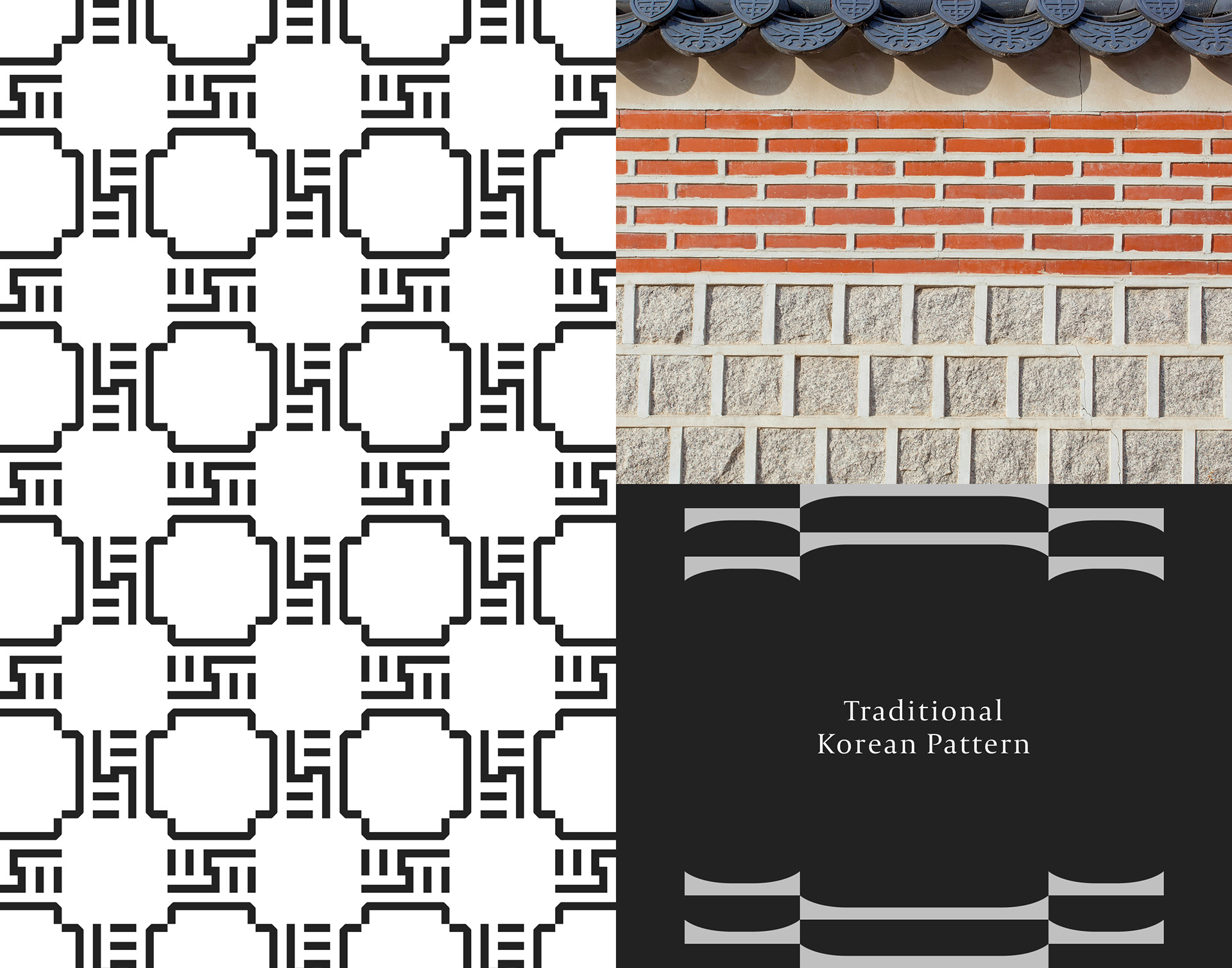
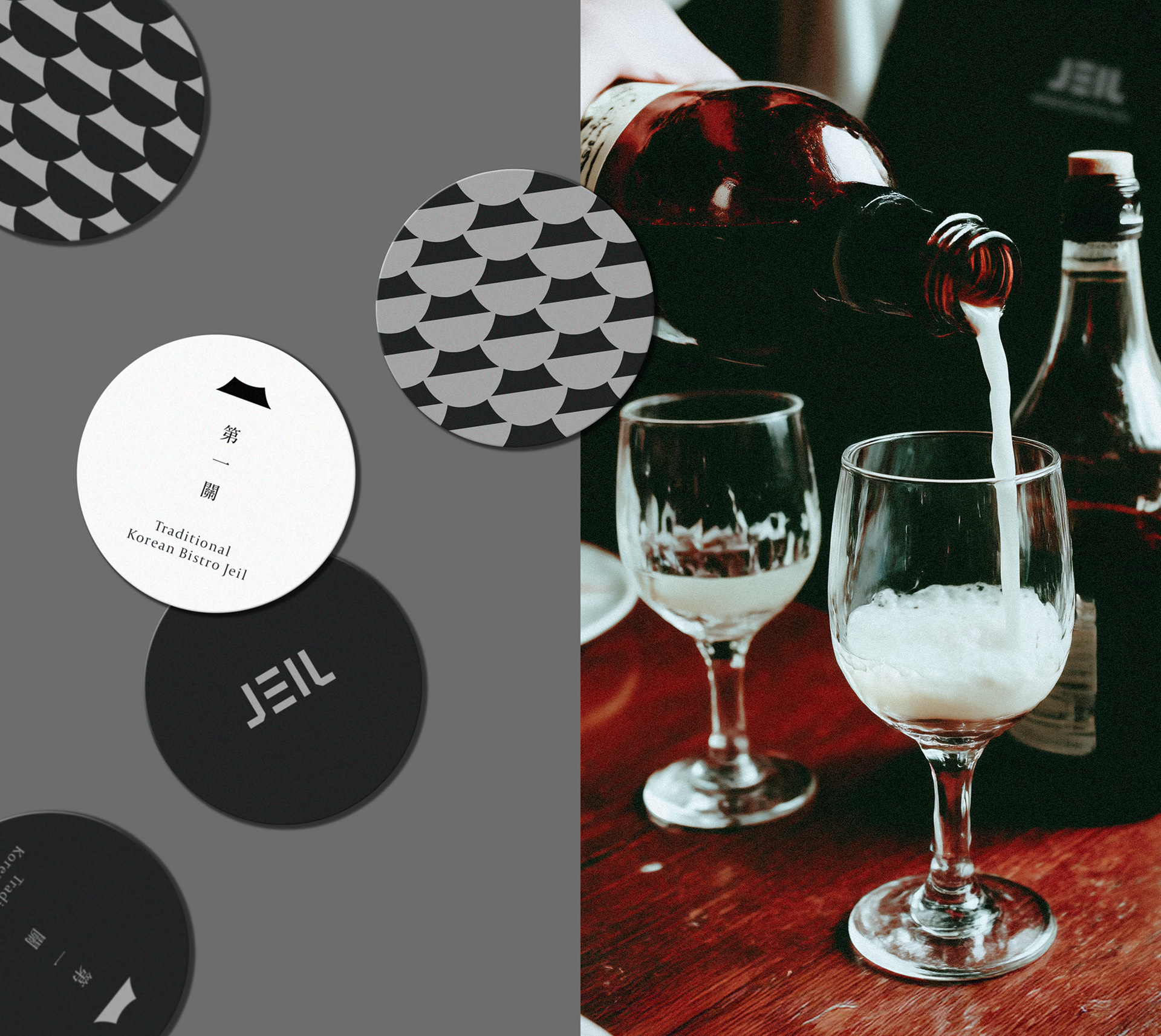
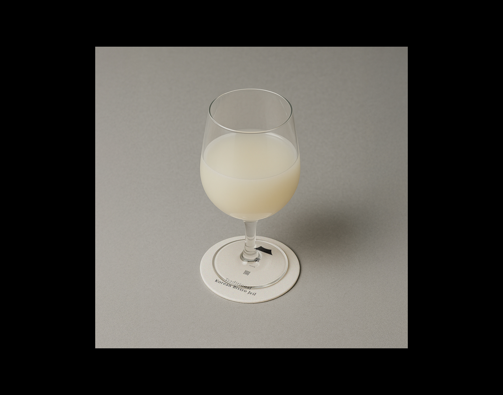
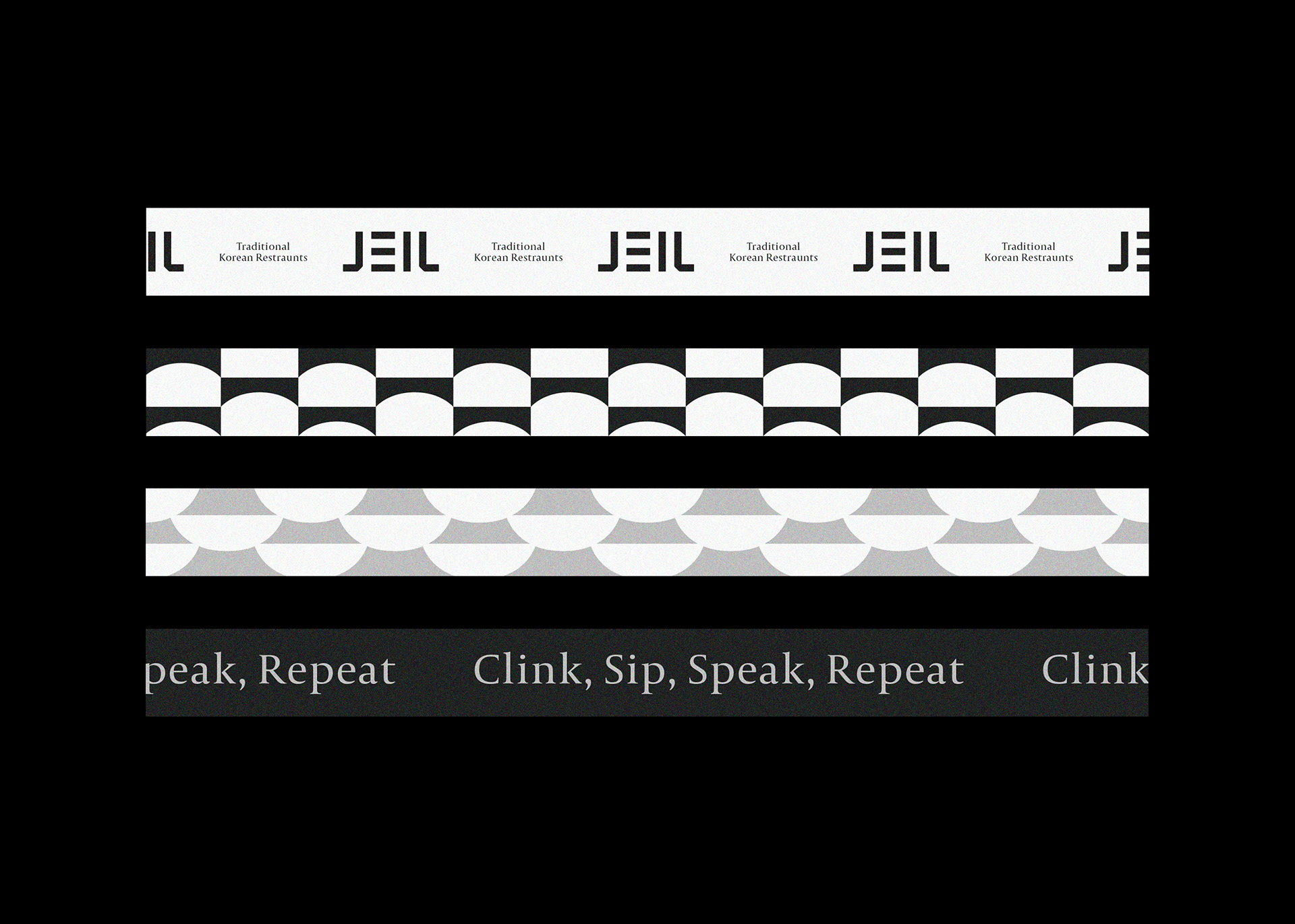
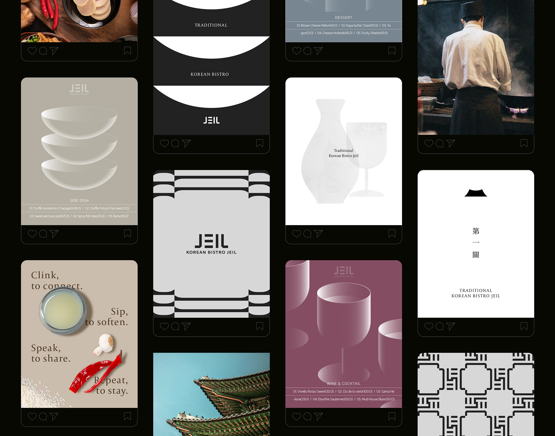
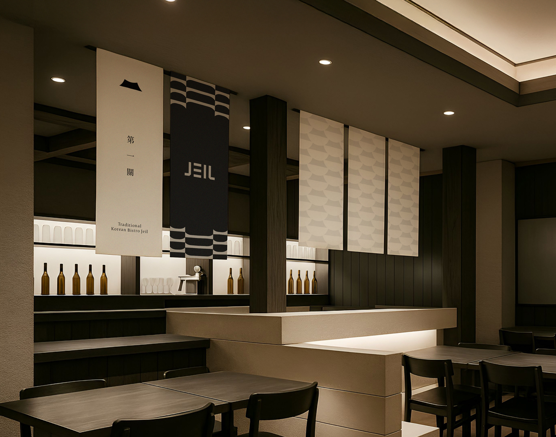
The logo design is inspired by ‘eaves,’ a traditional Korean architectural element. The form of ‘JEIL’ has been modernly interpreted to reflect the elegant curves and structural balance of Cheoma, expressing sophistication and harmony. The brand colors, black and white, symbolize the harmony of Yin and Yang, representing a seamless blend of tradition and modernity. Additionally, the combination of smooth, natural curves and clear typography emphasizes restrained luxury and visual coherence.
-
'제일관'의 로고 디자인은 한국 전통 건축 요소인 ‘처마’를 모티프로 디자인했습니다. ‘JEIL’의 형태에서 처마의 우아한 곡선과 구조를 현대적으로 해석하여 세련미와 균형감을 표현했습니다. 브랜드 컬러는 음과 양의 조화를 의미하는 블랙과 화이트를 적용해 전통과 현대의 조화로움을 나타냈습니다. 또한 부드럽고 자연스러운 곡선과 명료한 타이포그래피를 결합하여 절제된 고급스러움을 강조했습니다.
-
'제일관'의 로고 디자인은 한국 전통 건축 요소인 ‘처마’를 모티프로 디자인했습니다. ‘JEIL’의 형태에서 처마의 우아한 곡선과 구조를 현대적으로 해석하여 세련미와 균형감을 표현했습니다. 브랜드 컬러는 음과 양의 조화를 의미하는 블랙과 화이트를 적용해 전통과 현대의 조화로움을 나타냈습니다. 또한 부드럽고 자연스러운 곡선과 명료한 타이포그래피를 결합하여 절제된 고급스러움을 강조했습니다.
Client : Baron fnc
Design : FEELQ WORKS
-
Instagram : feelqworks
Behance : feelqworks
Thank You
Design : FEELQ WORKS
-
Instagram : feelqworks
Behance : feelqworks
Thank You